Credit: NG Launch Reel by Gian M.
NATIONAL GEOGRAPHIC APP REDESIGN
The National Geographic Magazine app for iOS and Android gets a fresh new look with the recent redesign. The app was redesigned with the users in mind. Taking the users through an immersive storytelling from streaming videos to browsing the latest issue on the go. The new app also provides users access to a curated set of magazine issues dating back to 1888.
One of the purpose of the redesign was to provide users with a better app that they would love to use. The original National Geographic app had low reviews on the iOS store (2.1 stars). After the relaunch of the app and with amazing news, the National Geographic app is sitting on a 4.8 stars on the iOS store and 4.4 stars on the Android Play store!
Overview
The National Geographic mobile app redesign was a huge initiative with collaboraton across product, design, and engineering.
The project was led by talented design leads and senior designers. The team consisted of 8 designers designing and focusing on different areas of the app.
The project duration was about 8 months in total.
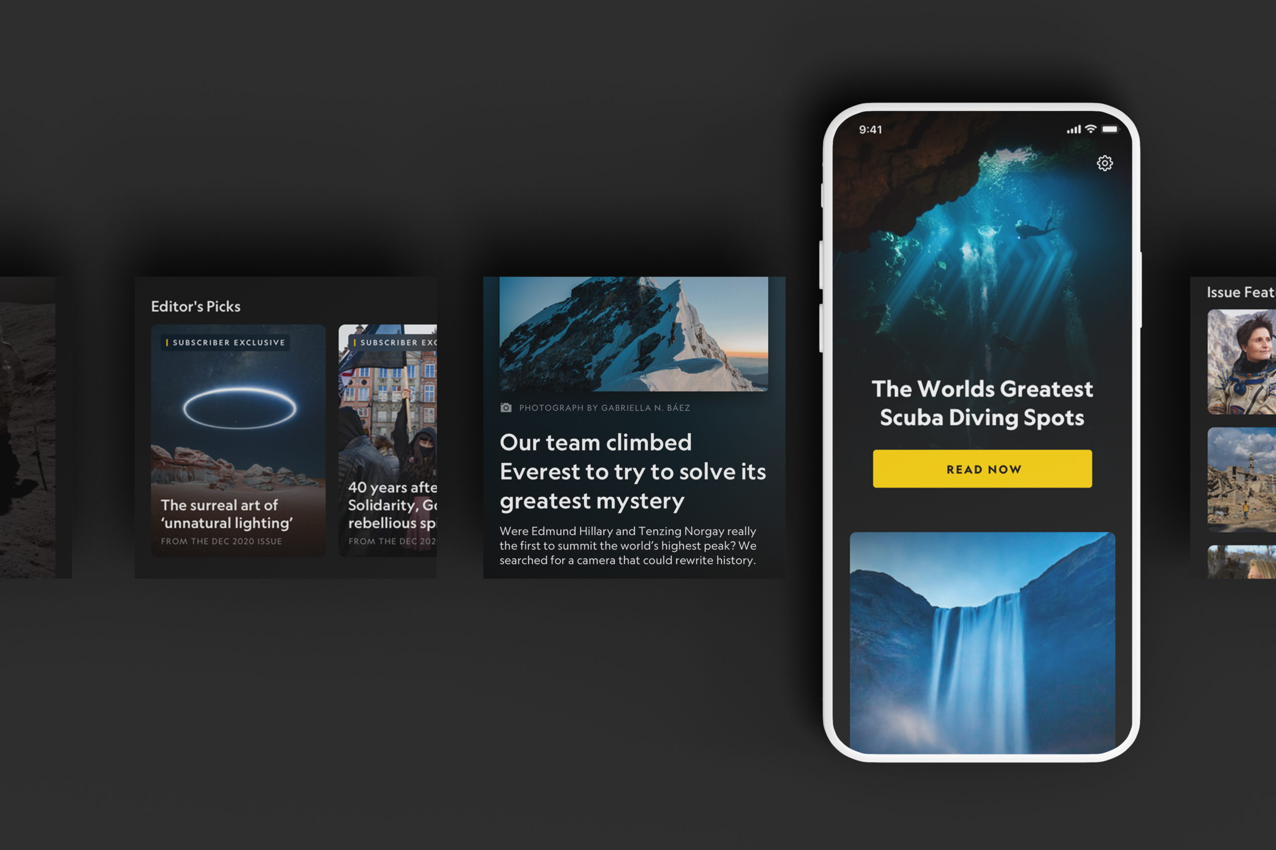
My Role
My role on this project was split into two portions.
The first part was designing a couple of features for the mobile platform side.
The second part, which was a significant portion of my role, was contributing to the tablet version of the mobile app for both iOS and Android.
The goal was to translate all the mobile (smaller) breakpoints over to the tablet (larger) breakpoints.
I also took process on design qa for phone and tablet on multiple devices for iOS and Android.
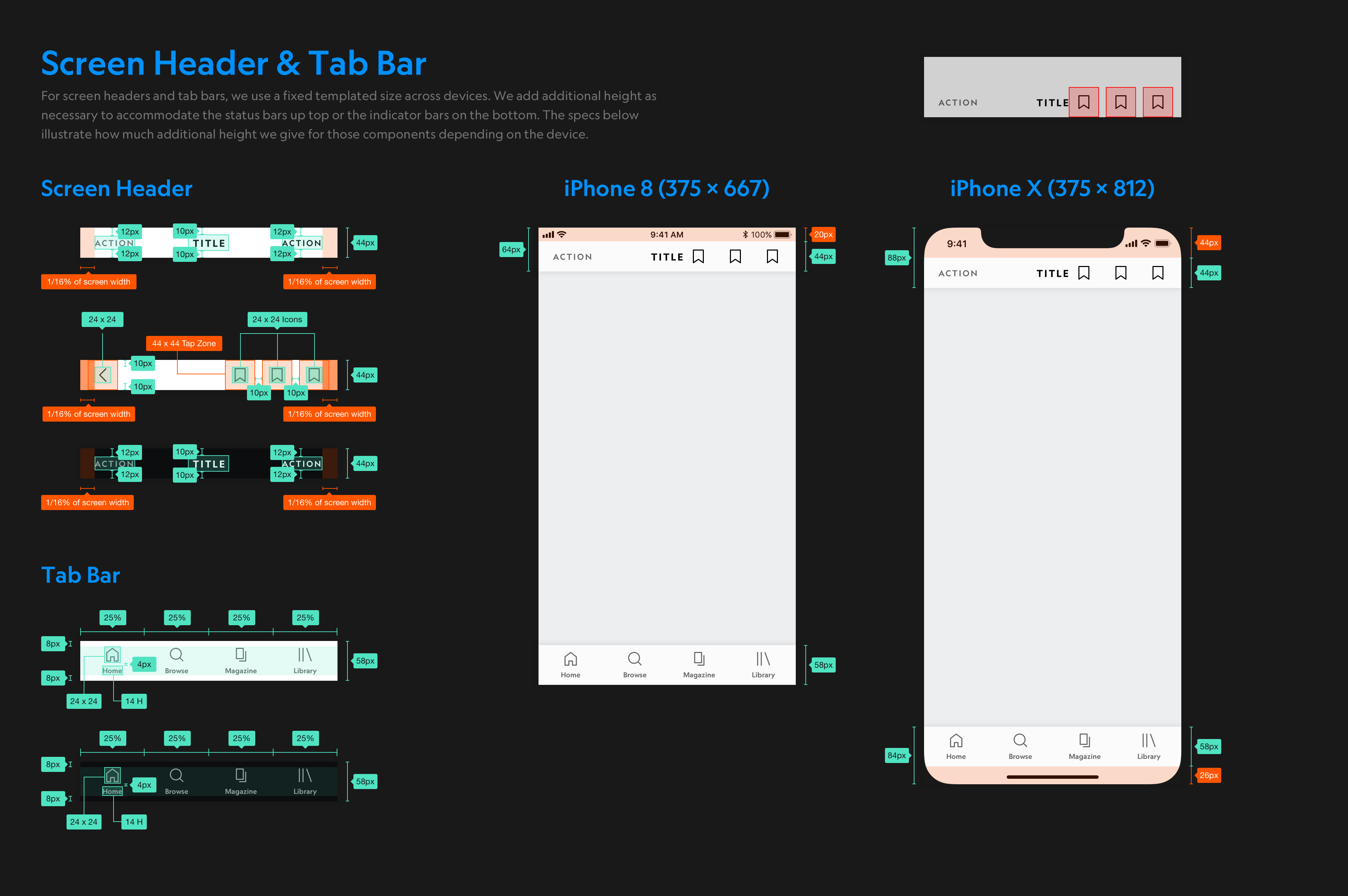
I had to make sure that the tablet designs followed and adhere to the design systems set in place in our NG global stylesheet for this redesign.
DESIGNING FOR TABLET INTERFACE
Mobile to Tablet
When taking designs from mobile and translating over to tablet, it isn't just a 1:1 conversion. There were many technical and design constraints we had to be aware of. On tablet, we weren't just designing for portrait view, we had to make sure that the designs make sense when users were using the app in landscape view. Some constraints also come from the differences between the iOS and Android platforms.
Features that I contributed to and are shown below:
- Messaging Modals
- Magazine
- Paywall
- Search
Messaging Modals
A feature that I contributed to on the mobile platform side was designing the modal for messaging within the app.
One use case of the modal is to notify users that they can stay up to date with NatGeo by allowing the app to provide users with alerts on new photos and stories.
By designing the symbols in the master library, we are then able to implement these designs in the rest of the app in a more efficient way.
We also identify design guidelines for each of our symbols/components that we created for this project. By doing so, engineers will have an easier time building the product and the process can be more streamlined.
We designed different variations of how the modals can be used to promote messaging to our users.

I first designed for mobile, light, and dark mode. I tested a couple of different iterations of the skeleton notification concept and decided on these.
In the earlier versions of these modals, the skeleton concept was all monotoned and felt very bland.
I suggested that we can add in the National Geographic yellow to bring more brand familiarity to it. The yellow square is also very similar to the National Geographic icon which many users are familiar with.
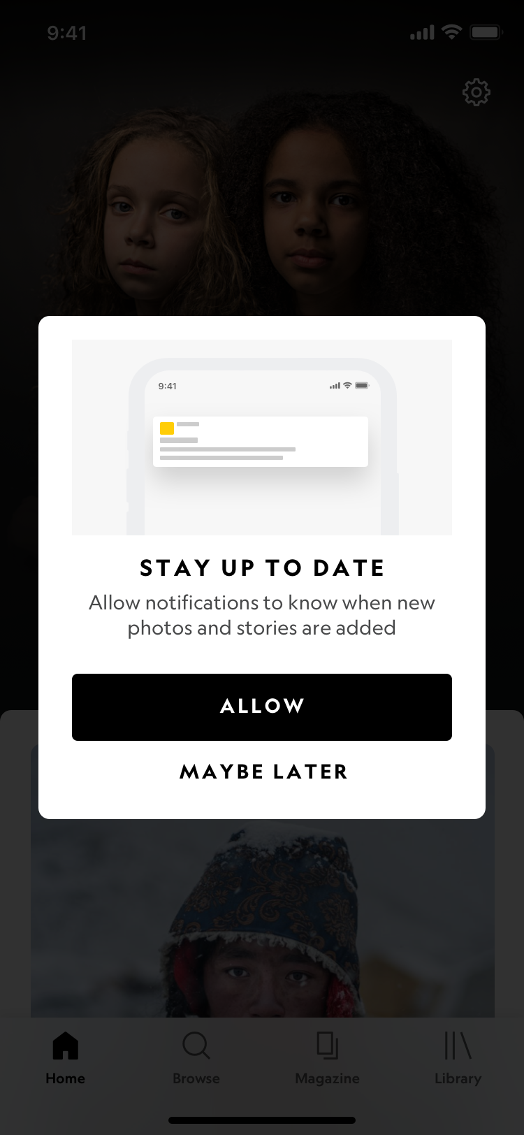
Mobile (iOS) Light Mode
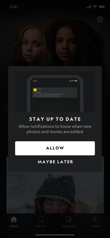
Mobile (iOS) Dark Mode
Following the iOS, Android, and Prism guidelines, I translated the mobile designs over to tablet. Making sure that grids, spacing, type ramps, and structure are correct for tablet.
I also made sure that the designs are responsive in both portrait and landscape view. Also responsive in the different breakpoints of the tablet devices.
I designed the light mode versions of iOS and android tablet first before designing the dark mode versions, which made things easier.
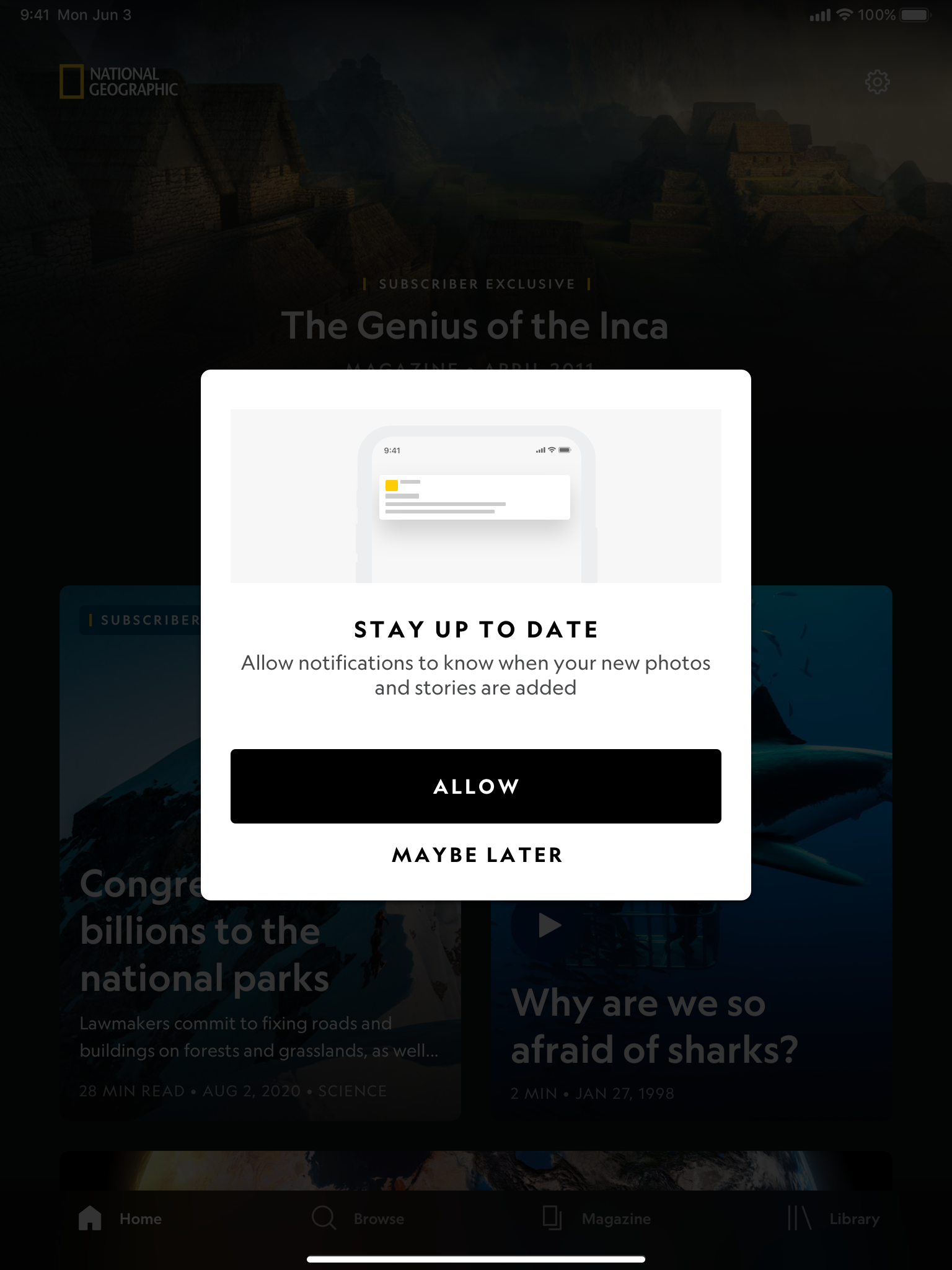
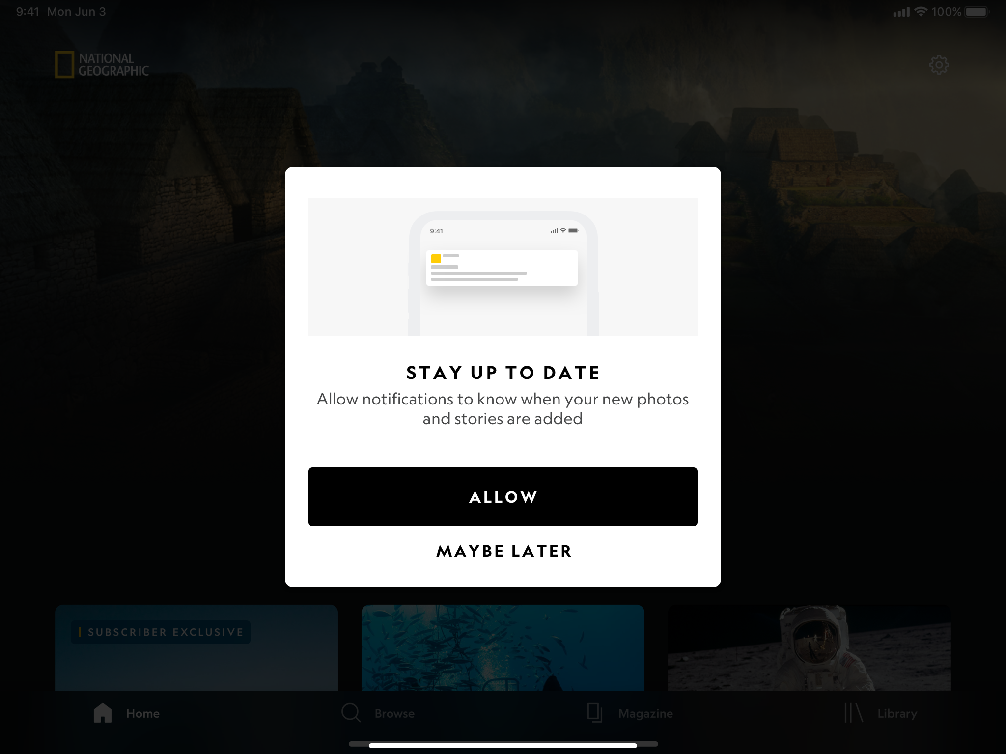
Tablet (iOS) Light mode: Portrait & Landscape mode
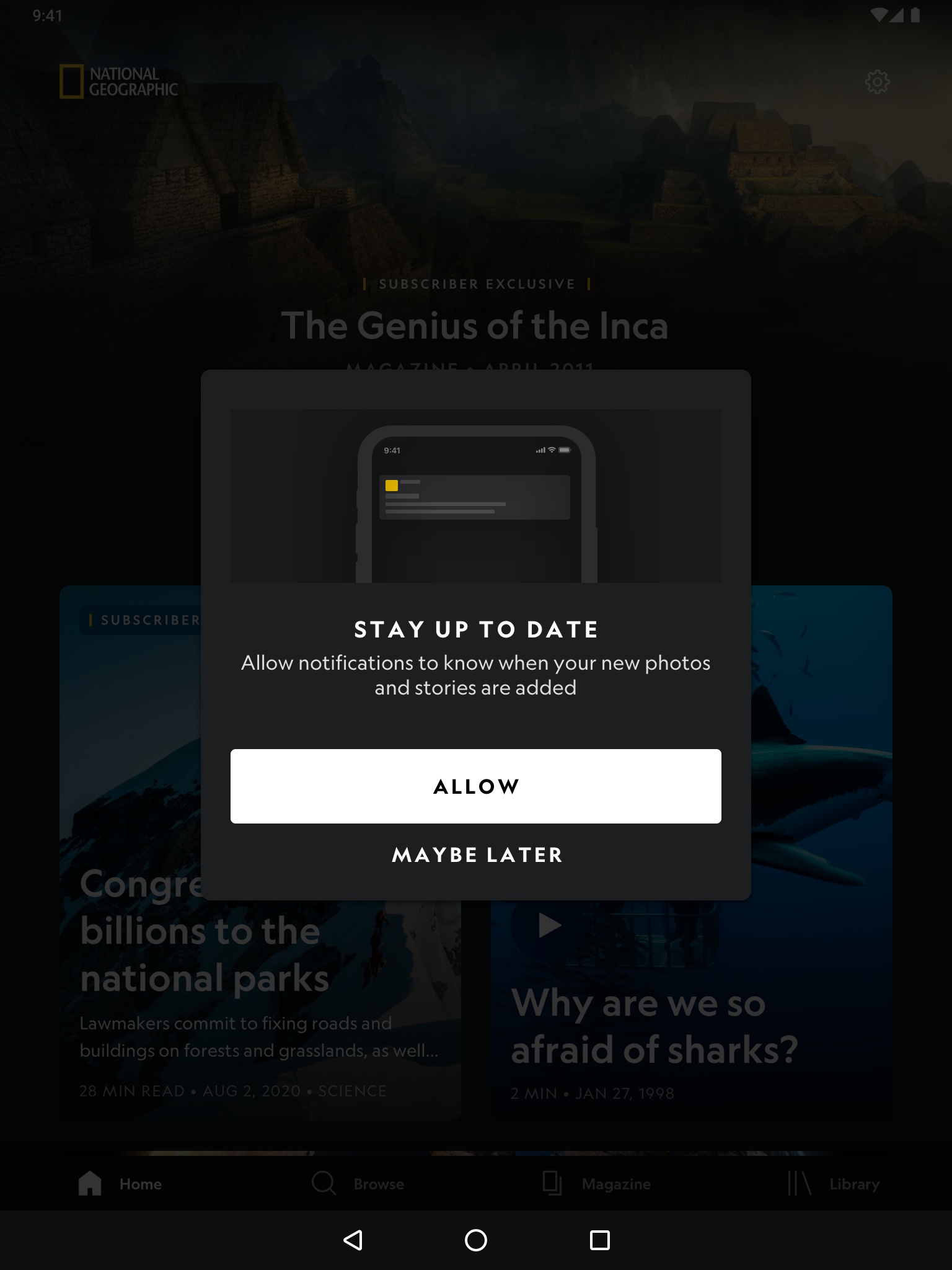
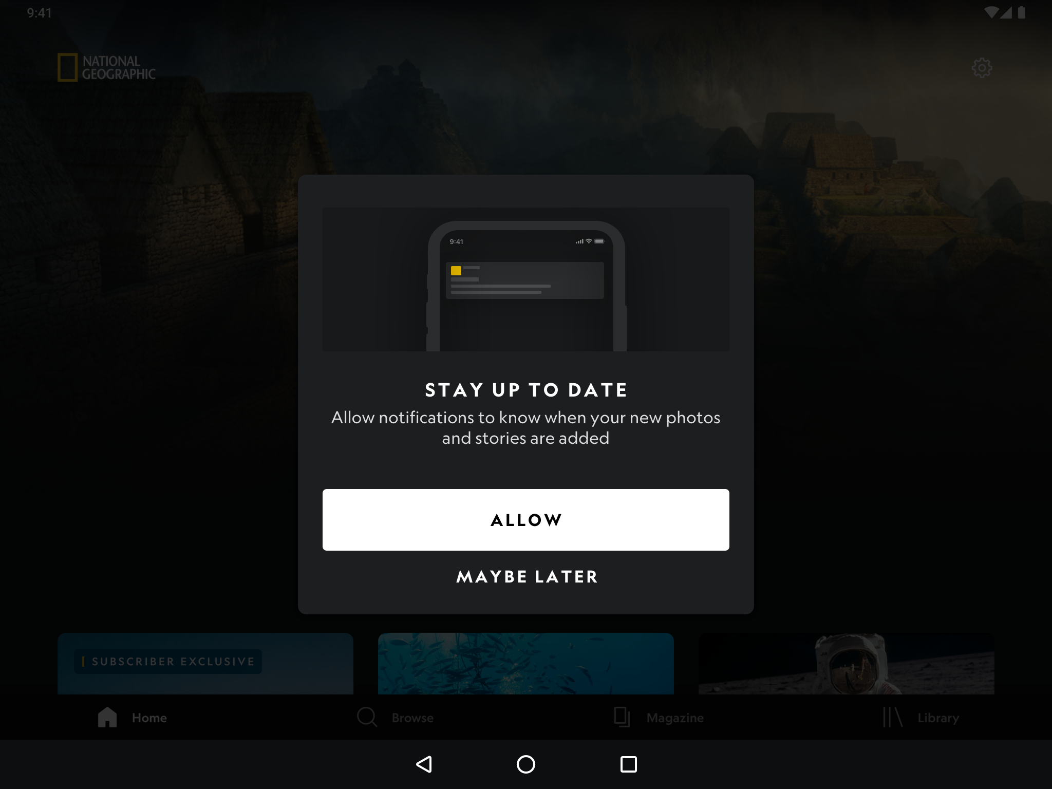
Tablet (Android) Dark mode: Portrait & Landscape mode
MAGAZINE
Translating the magazine page designs from mobile to tablet had some difficulties.
For example, the background image of the lead image is larger in size, and therefore we had to make compromises where either the images will get cut off or faces will be blocked by content on a larger screen size.
I had to decide how many magazine issues we want to display within the horizontal side scroll feature.

Mobile (iOS) Light Mode

Mobile (iOS) Dark Mode
Moving from mobile to tablet, the background image of the featured magazine may end up being cut off depending on the image.
This was a compromise that we had to decide on since National Geographic has many different types of amazing photos.
As for the recent issues section, users will notice that on mobile, they will only be able to see 1 and a half issues. While on tablet, 3 full issues will be displayed on portrait and 4 full issues can be seen on landscape view.
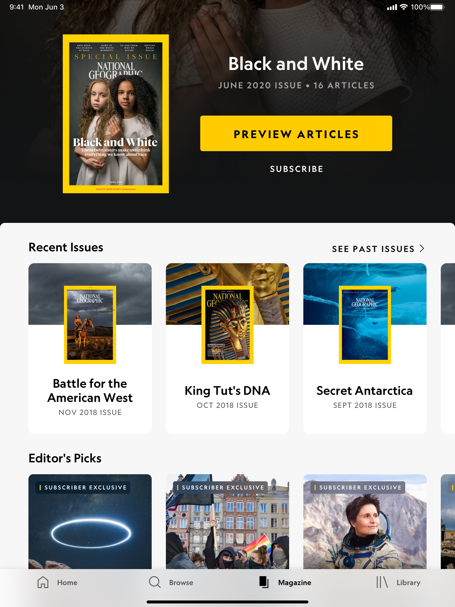
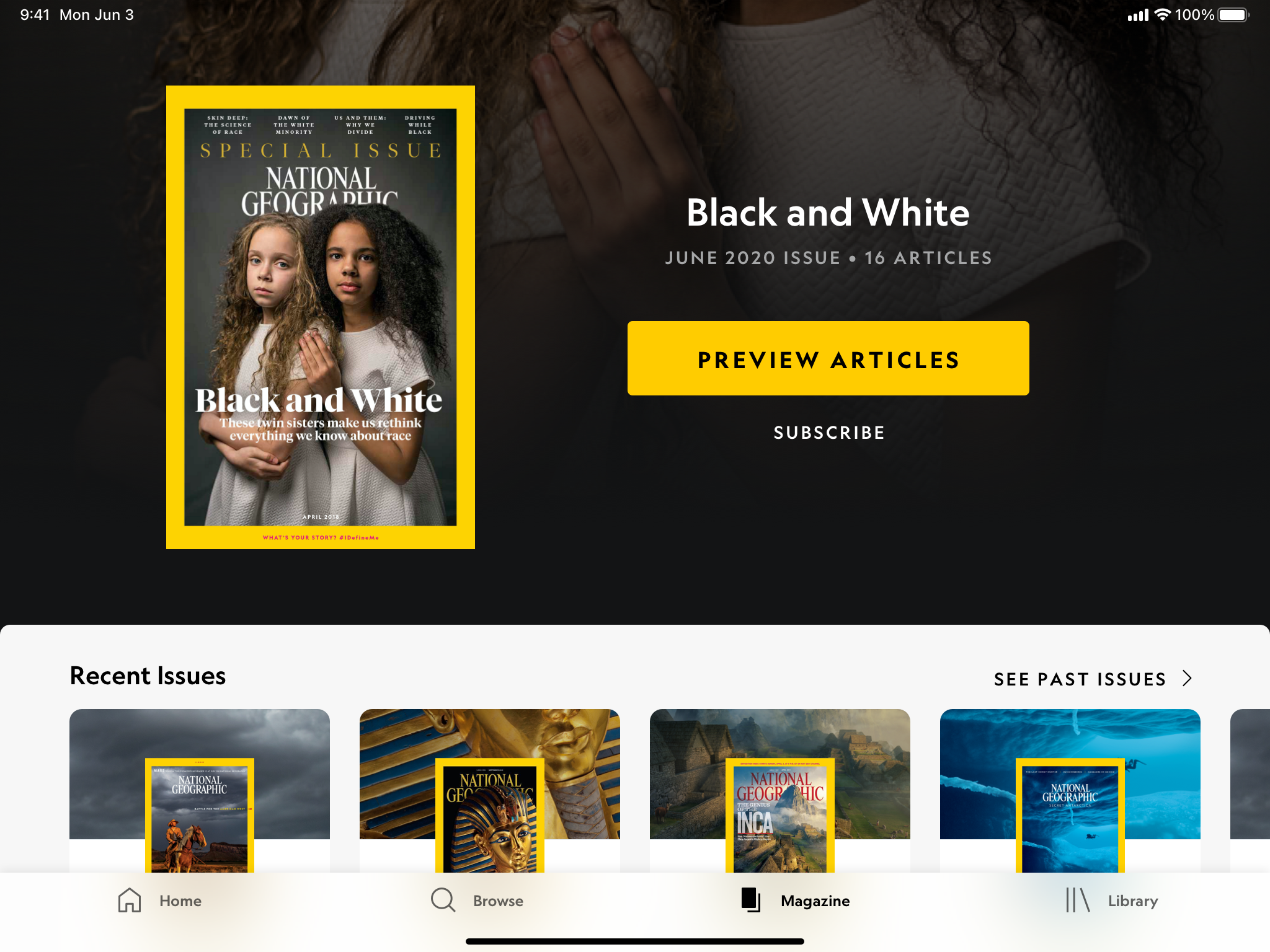
Tablet (iOS) Light Mode - Portrait & Landscape View
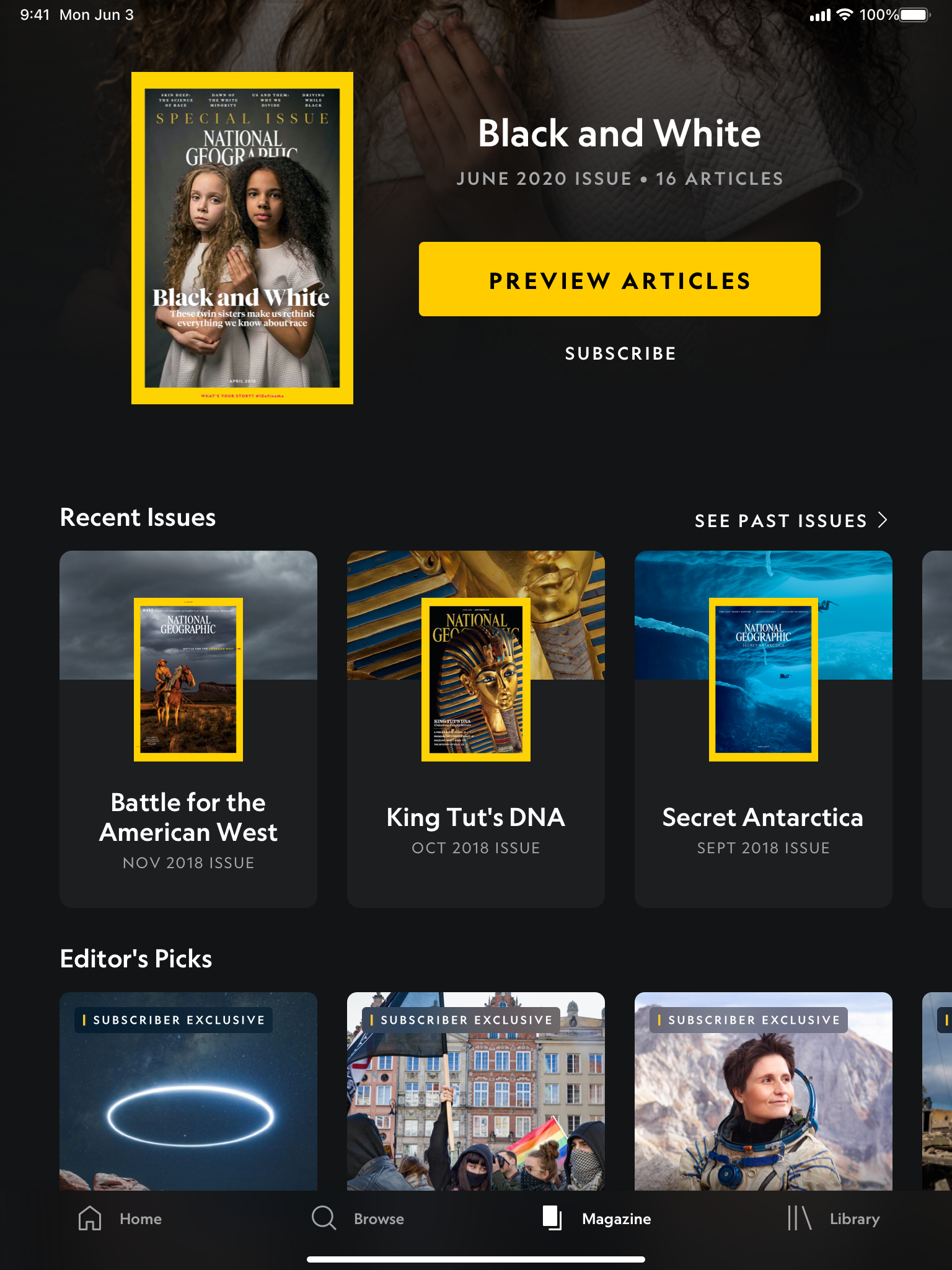
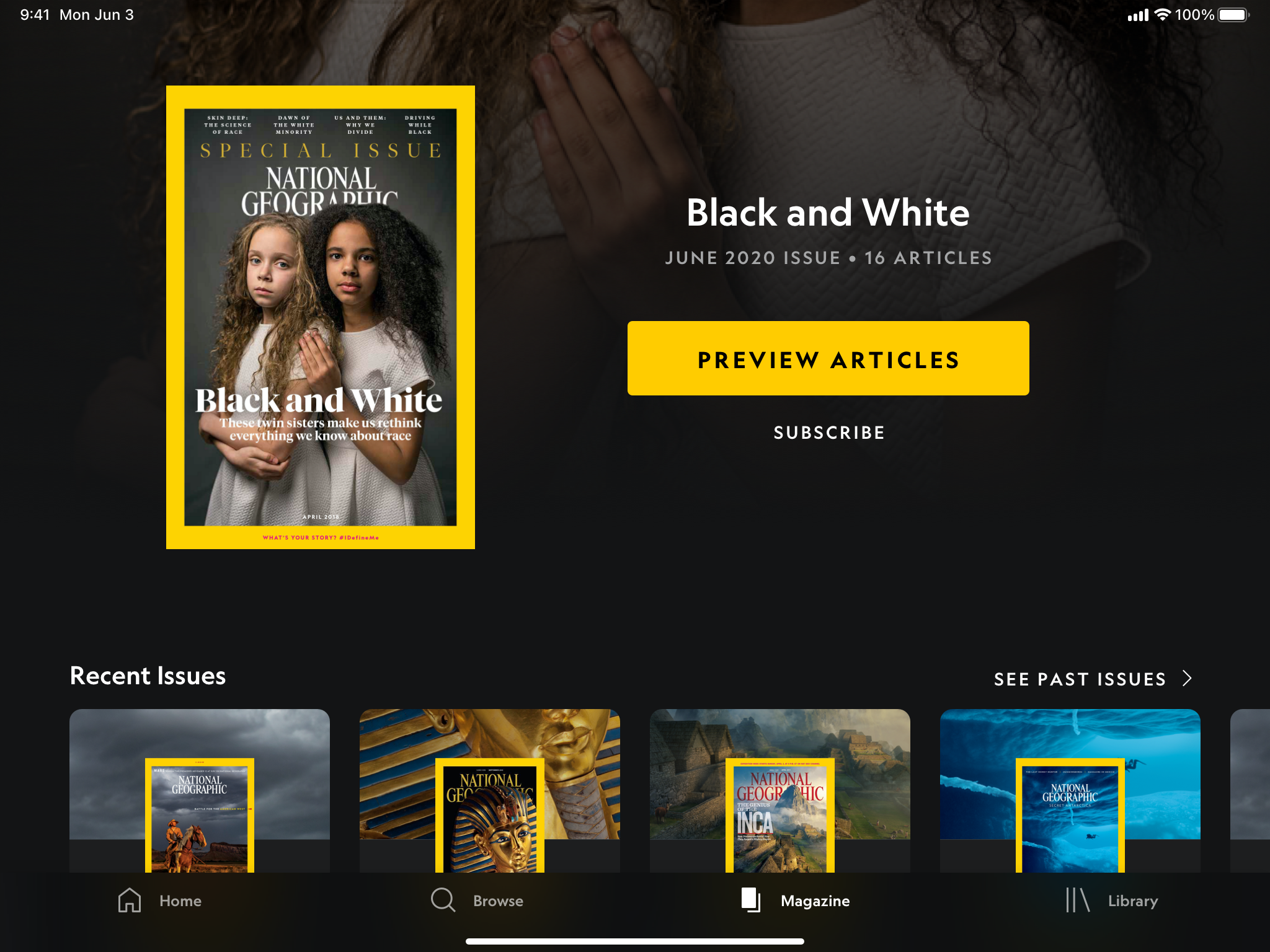
Tablet (iOS) Dark Mode - Portrait & Landscape View
Aside from just converting the designs from mobile to tablet, I also had to make sure the designs work on different breakpoints. This meant that we were designing for iPad, iPad 11, iPad 12 for iOS, standard tablet (equivalent to iPad), and Samsung tablet (equivalent to iPad 11) for Android. For iPad, we also had to make sure that the designs were working for multiflex - different breakpoints for when multi-apps are in use.
A few examples of iPad breakpoints
Dark mode and Android breakpoints are not shown
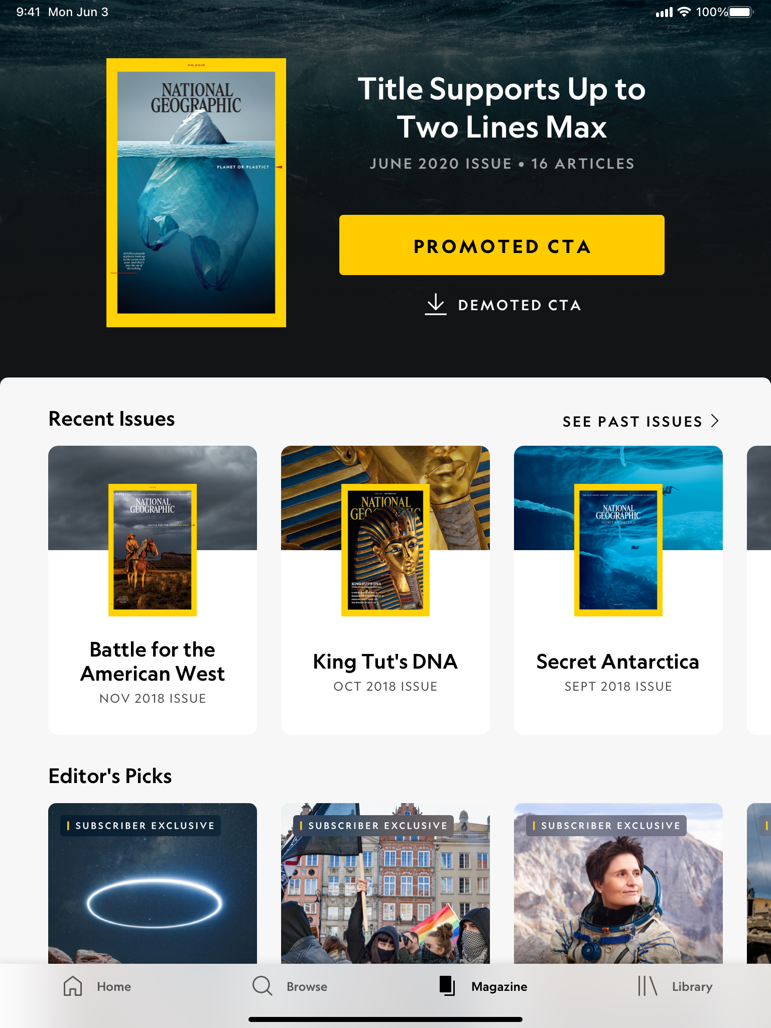
iPad - Portrait view
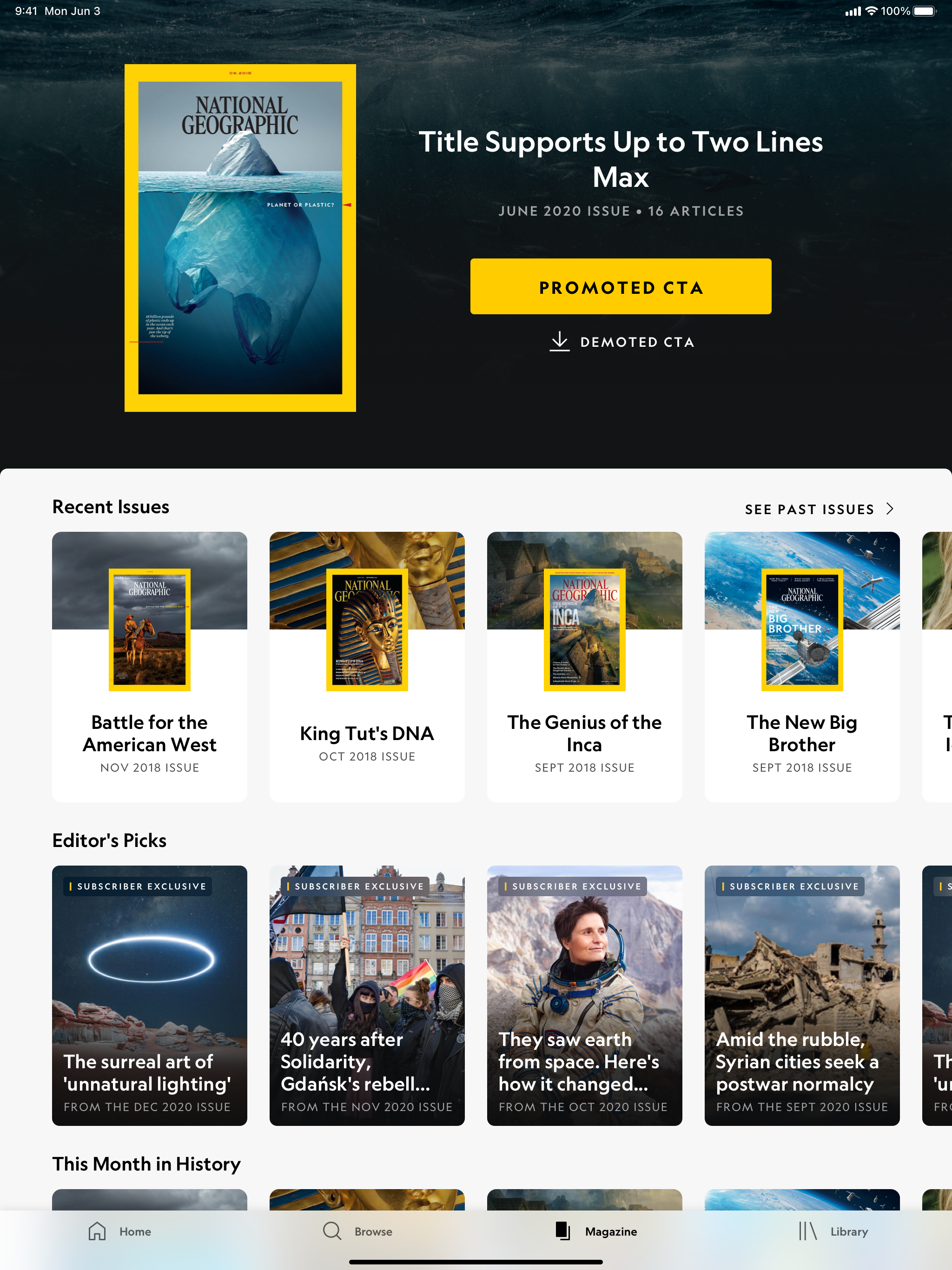
iPad 11 - Portrait view
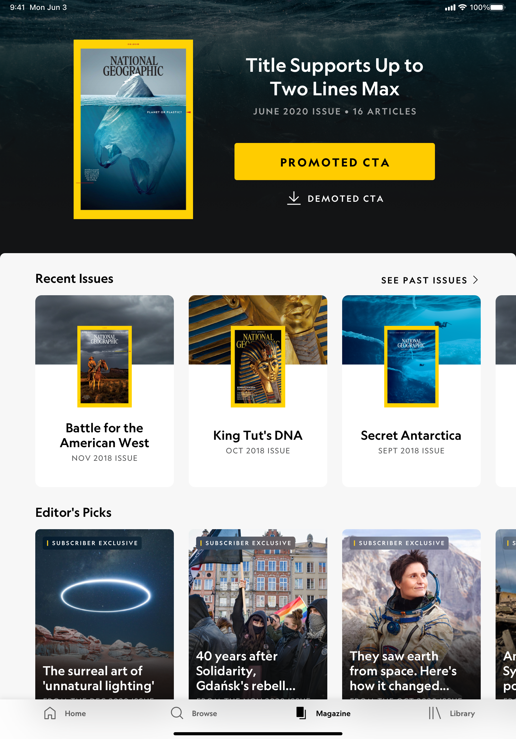
iPad 12 - Portrait view
PAYWALL & ONE ID
Converting the Paywall & One ID tablet designs from mobile was where I spent most of my time on the NatGeo project.
- The paywall contains the onboarding, payflow, paywall, and legal design screens.
- The One ID, which allows users to just use one account for all their Disney brands, contains the email collection, create account, sign in, error messaging, and reset password design screens.
The user flow of these screens had to be accurate when passing on to engineering as it would affect how users sign in, interact with the subscriptions, and additional paywall access. The total design artboard collection for Paywall & One ID tablet is over 300 screens for each platform (iOS & Android).
Below is just a small sneakpeek of the Paywall and One ID experience:
Not shown: entire Paywall & One ID experience, breakpoints, multiflex, Android
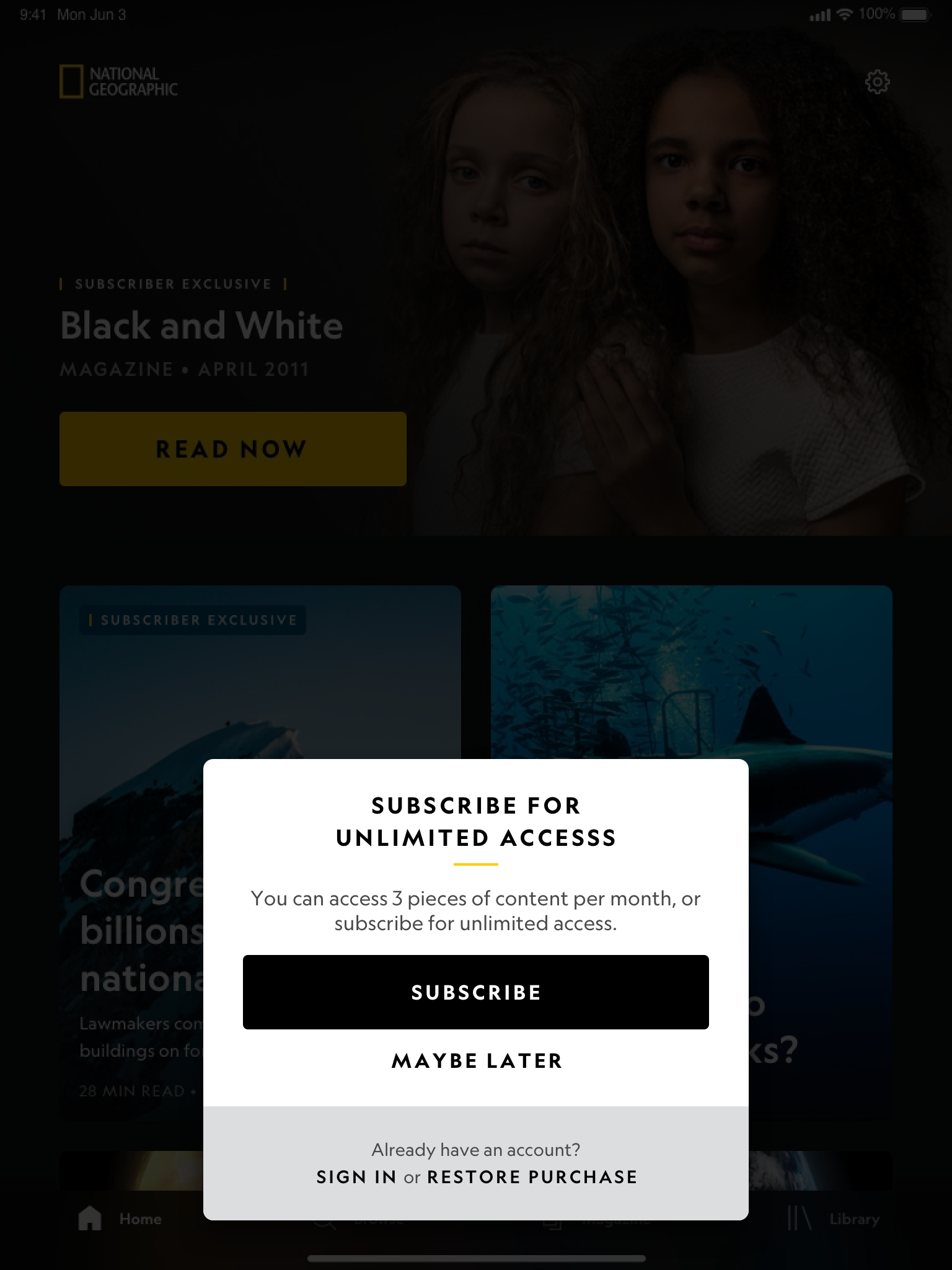
iPad - New Subscriber - Light Mode
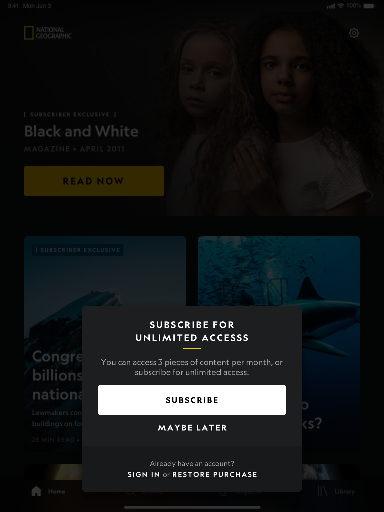
iPad - New Subscriber - Dark Mode
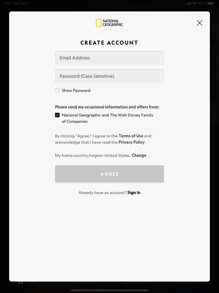
iPad - New Account - Light Mode
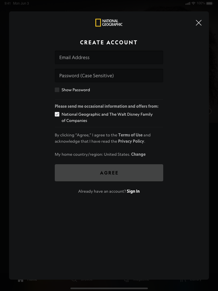
iPad - New Account - Dark Mode
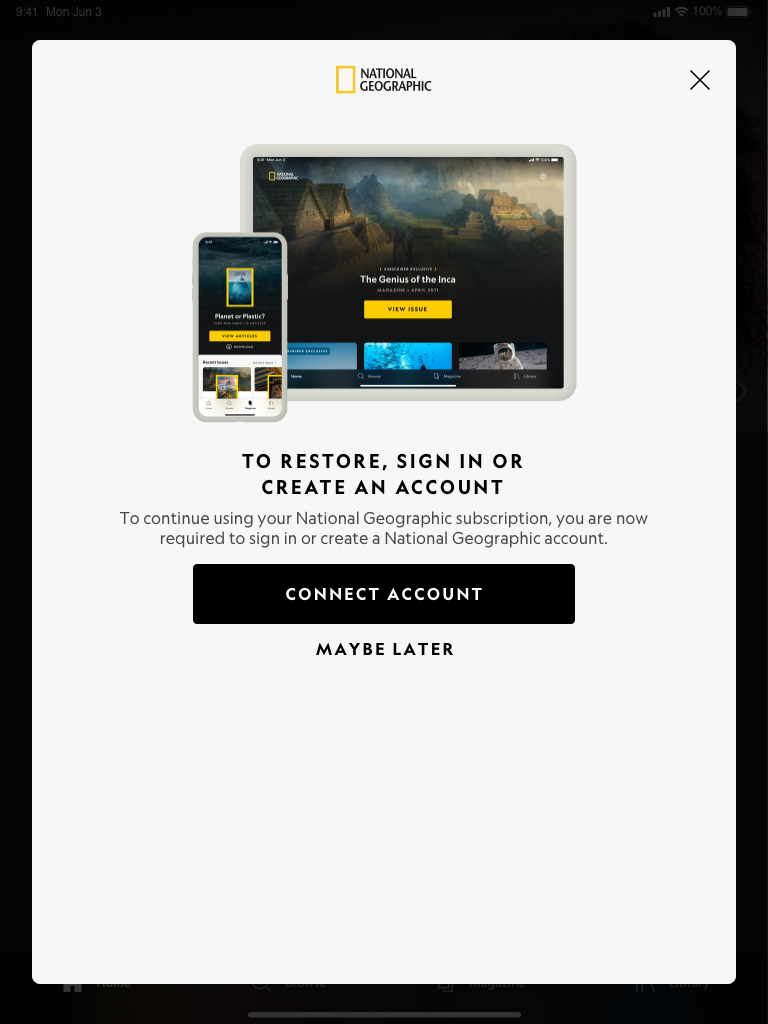
iPad - Link Account - Light Mode
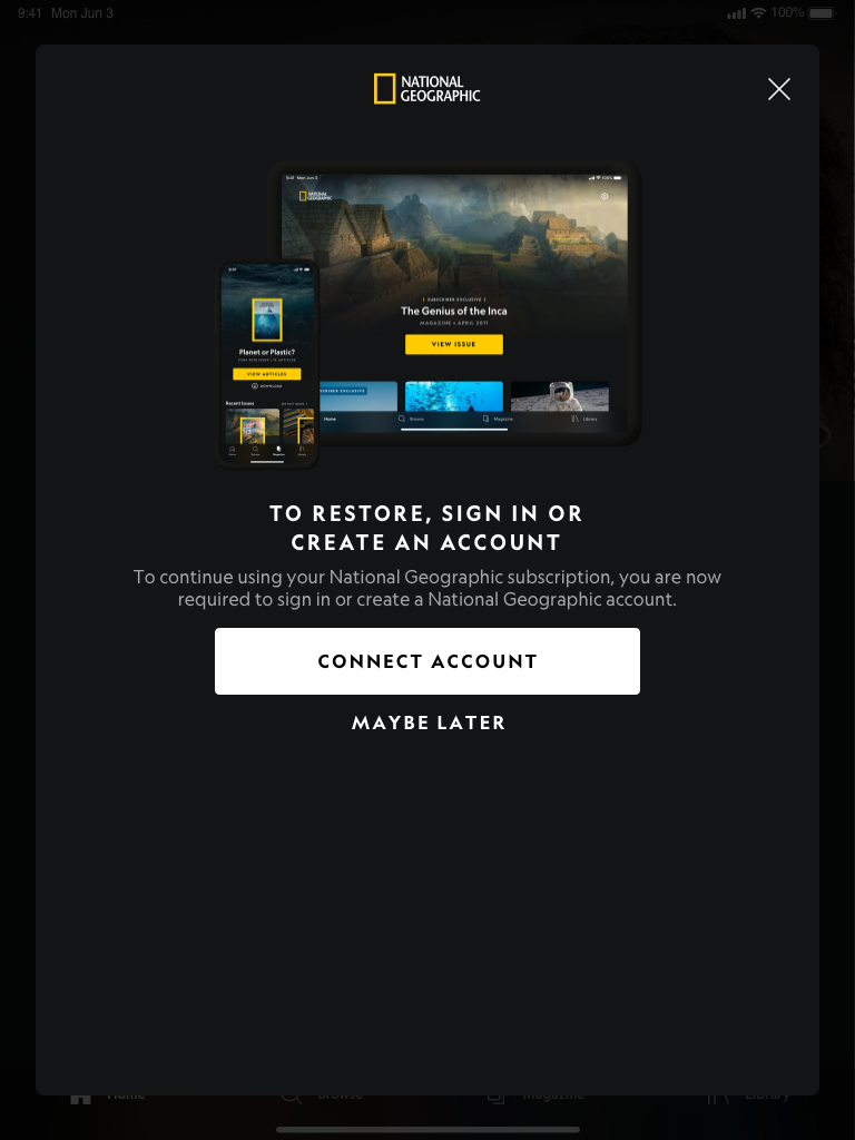
iPad - Link Account - Dark Mode
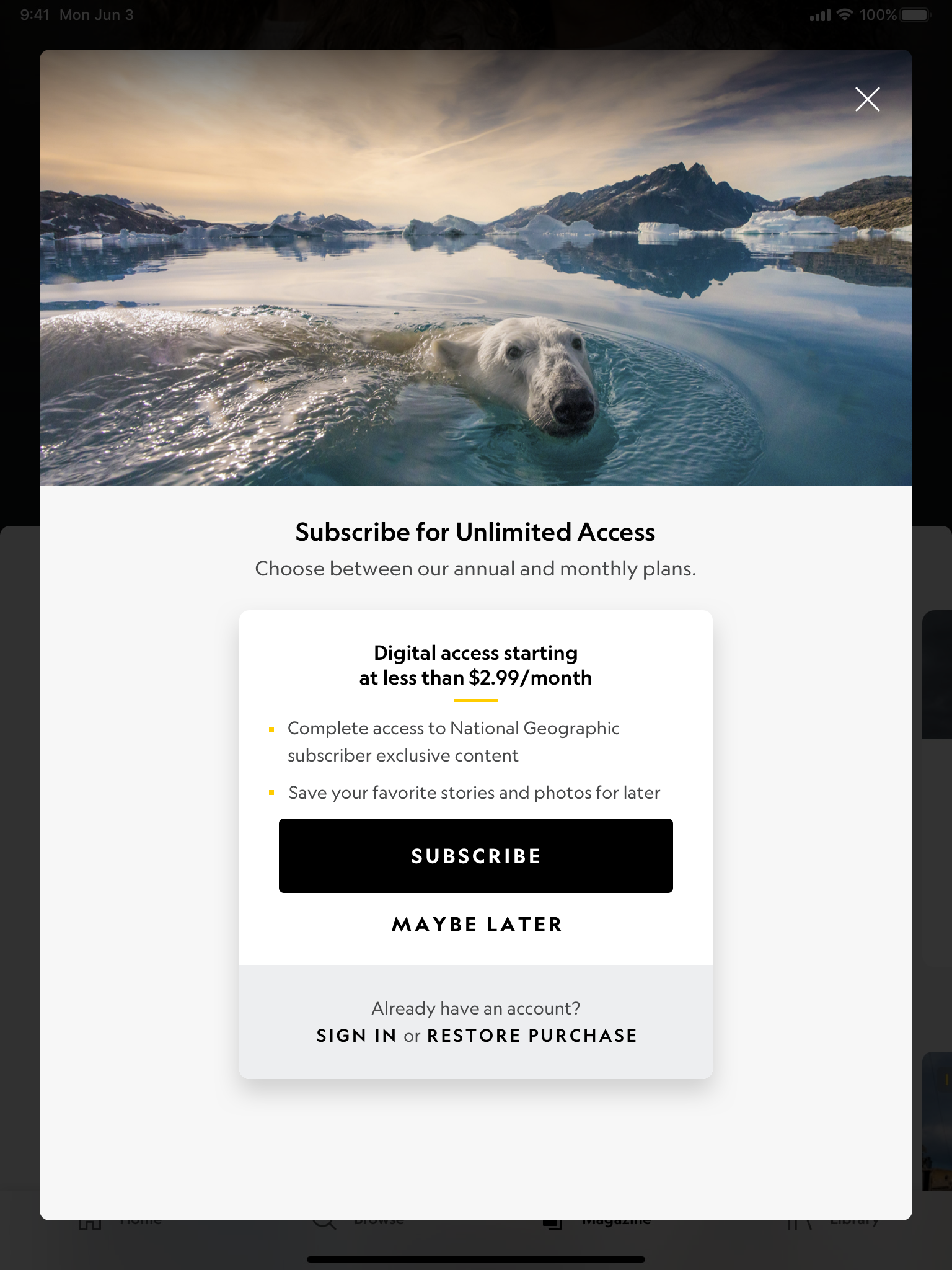
iPad - Guest - Light Mode
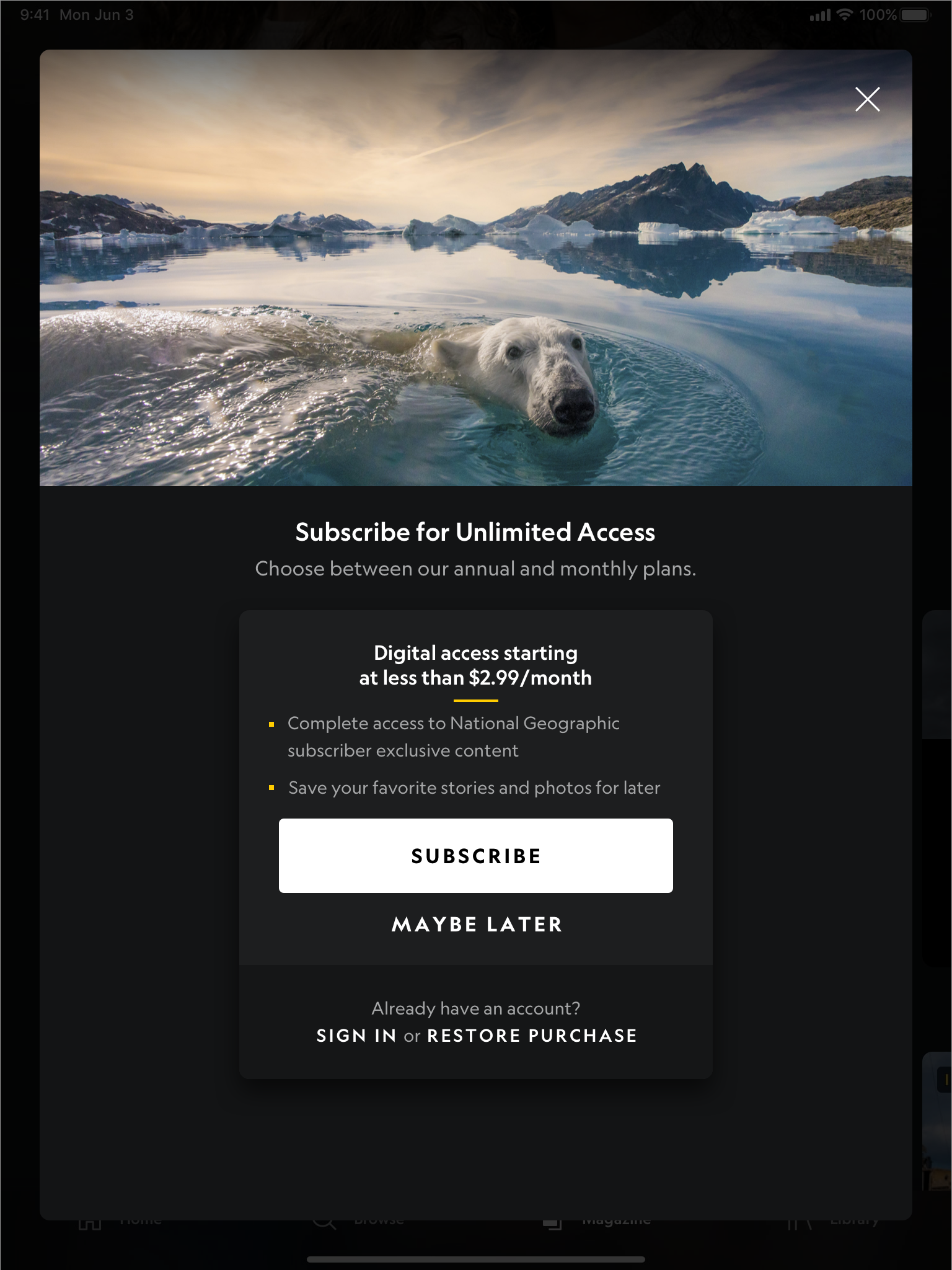
iPad - Guest - Dark Mode
SEARCH & BROWSE
The Search & Browse was designed to be a streamlined experience. Users are able to go to the browse tab of the app and be greeted with featured topics and categories curated by National Geographic. Featured topics would show many of the trending news that the company wants users to know about and read up on, while categories are important pillars of the National Geographic brand.
Once a user selects a tile they wish to view, users are taken to a collections page that only shows related contents. The contents are sorted into all, articles, photos, videos, and magazine.
Users can also search for a keyword and any related content will show up in the search results with the same sorting function.
Below is a small snippet of the Search & Browse feature for tablet:
Only a few experiences are shown here. Feel free to check out the National Geographic app for more content!
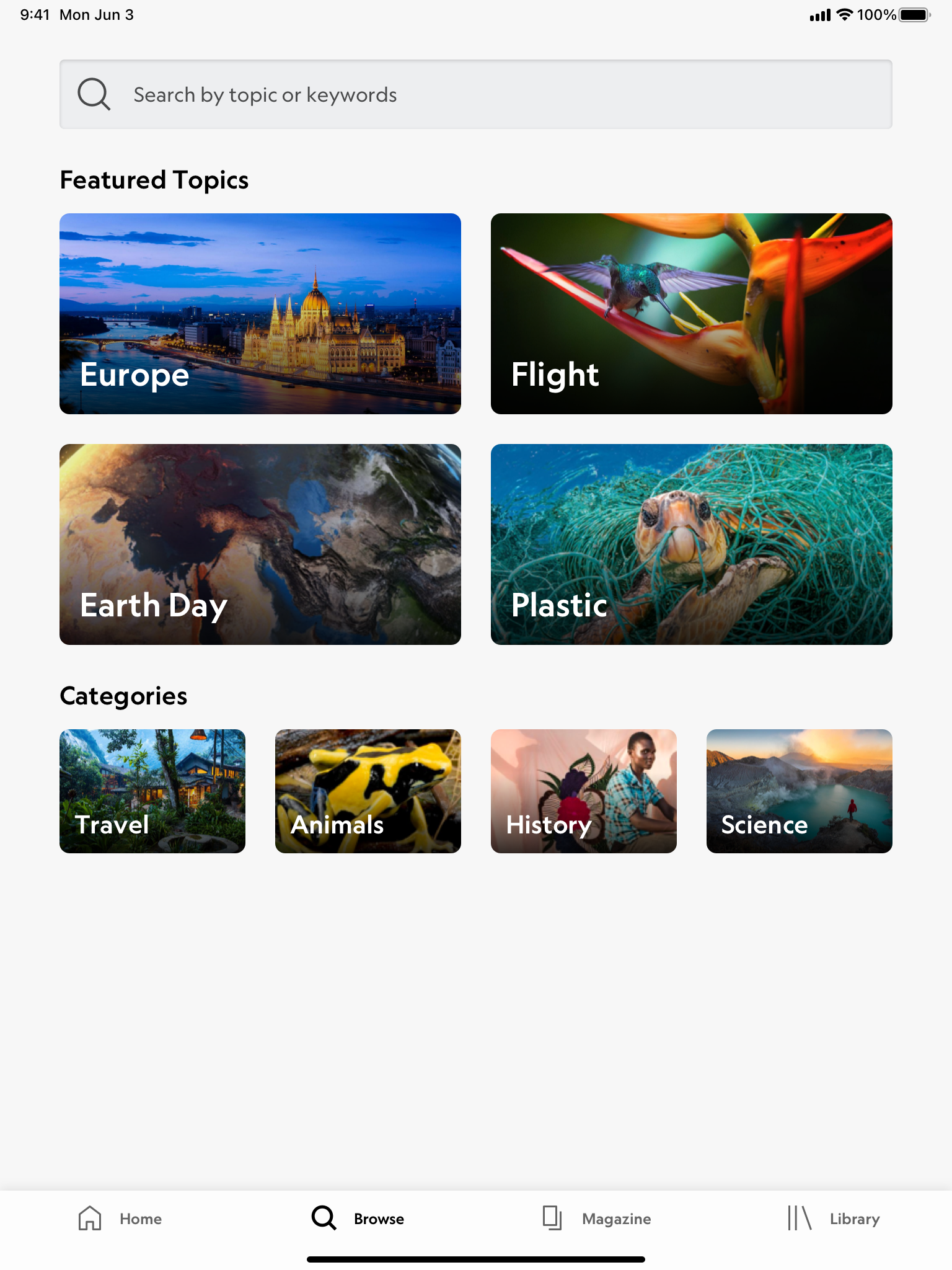
iPad - Browse - Light Mode
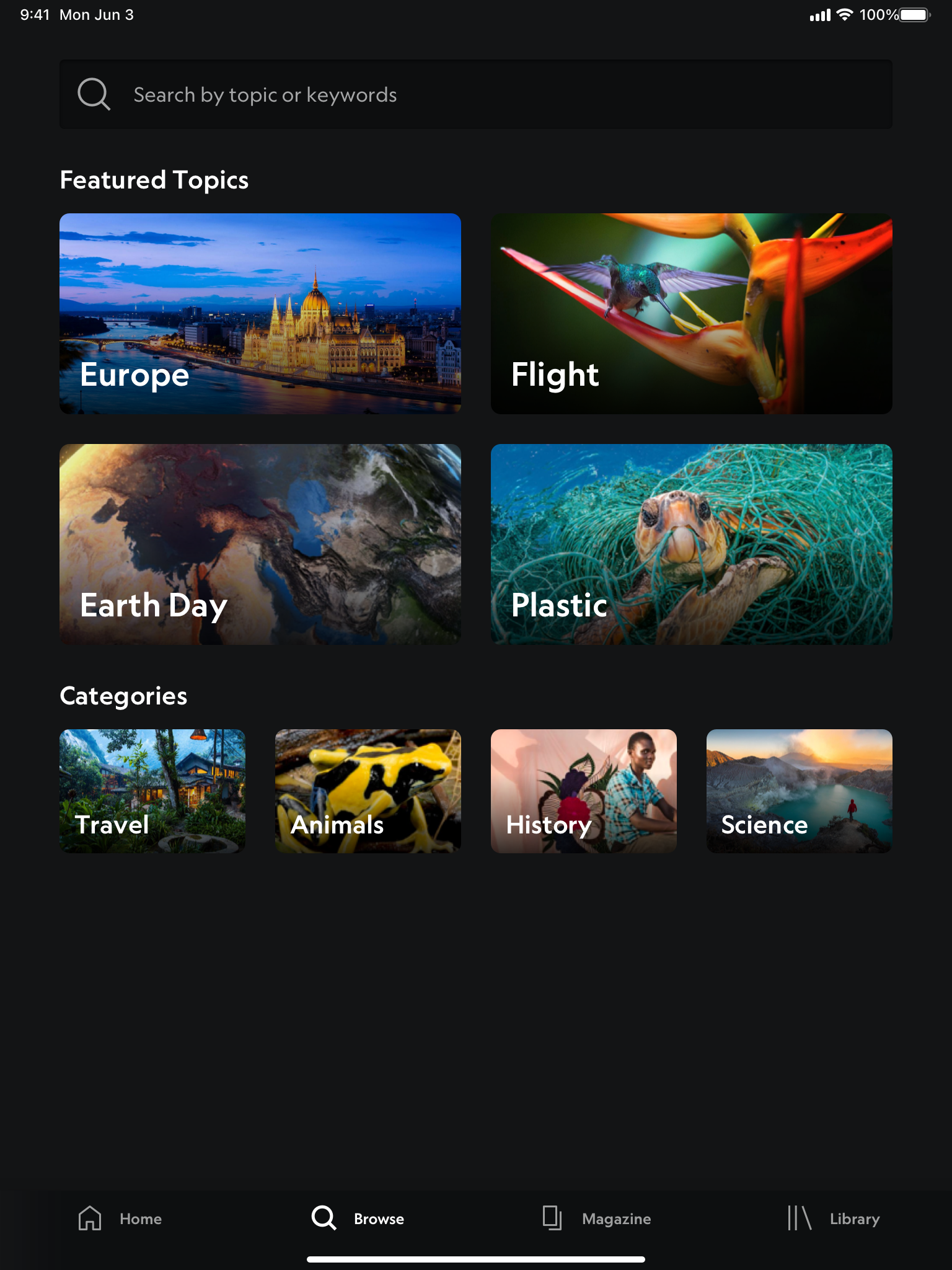
iPad - Browse - Dark Mode
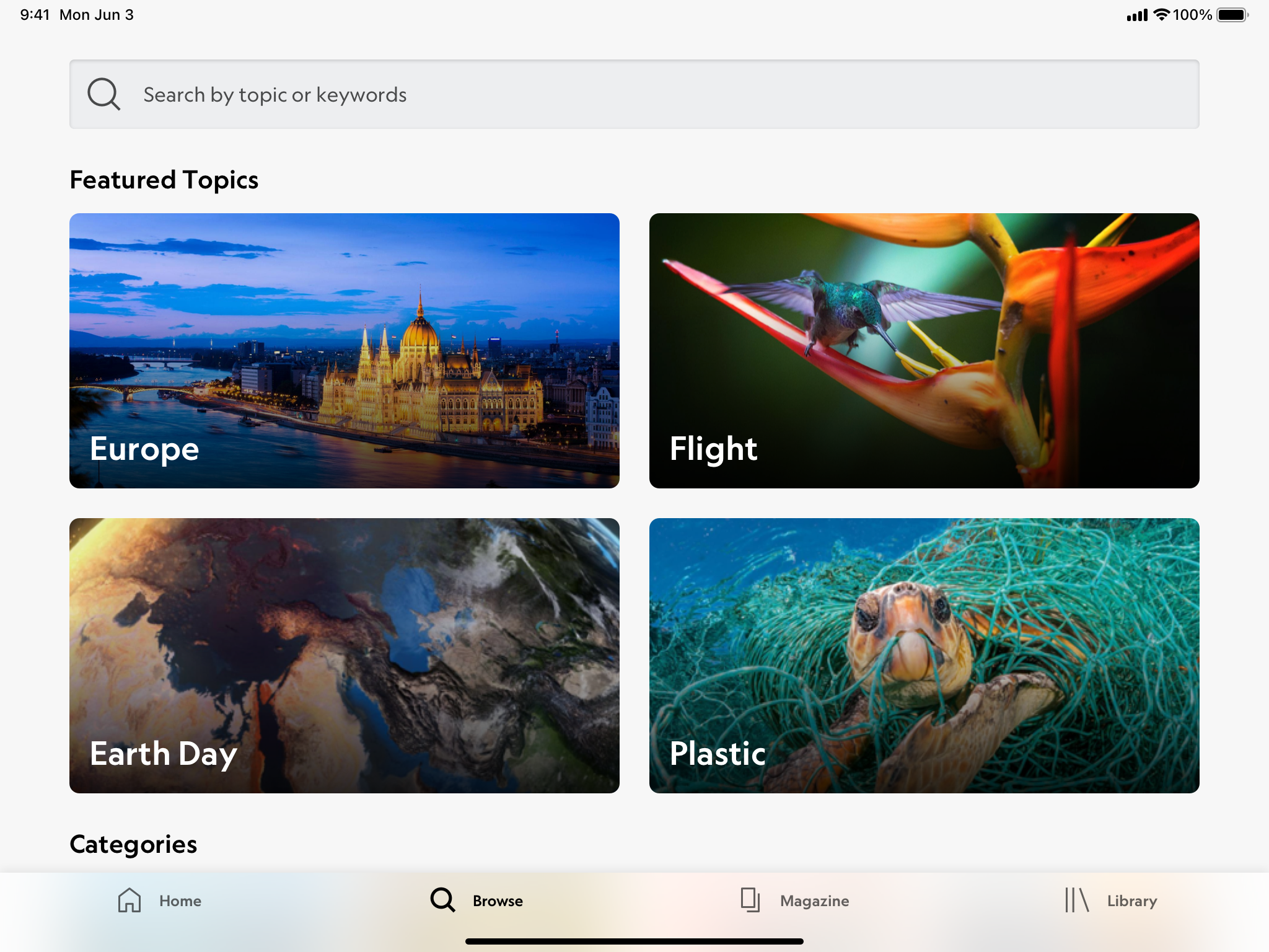
iPad - Browse - Light Mode - Landscape
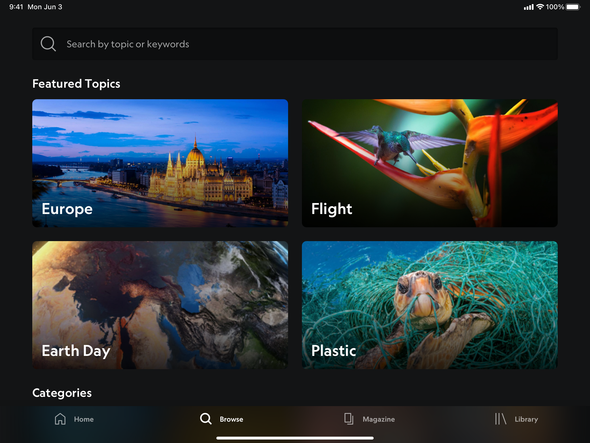
iPad - Browse - Dark Mode - Landscape
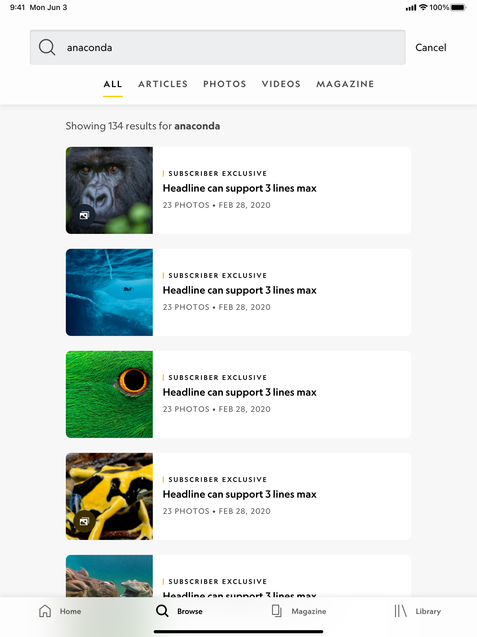
iPad - Search Results - Light Mode
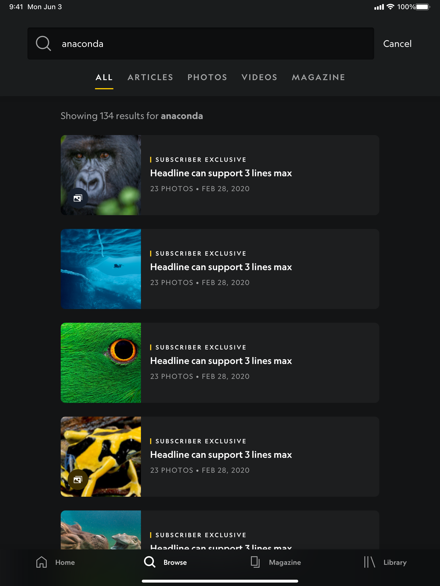
iPad - Search Results - Dark Mode
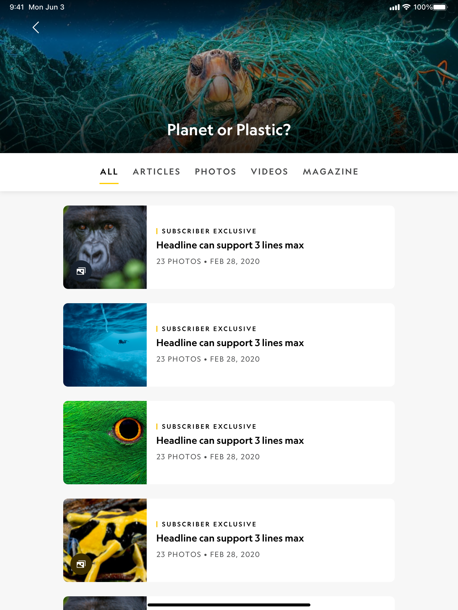
iPad - Collections - Light Mode
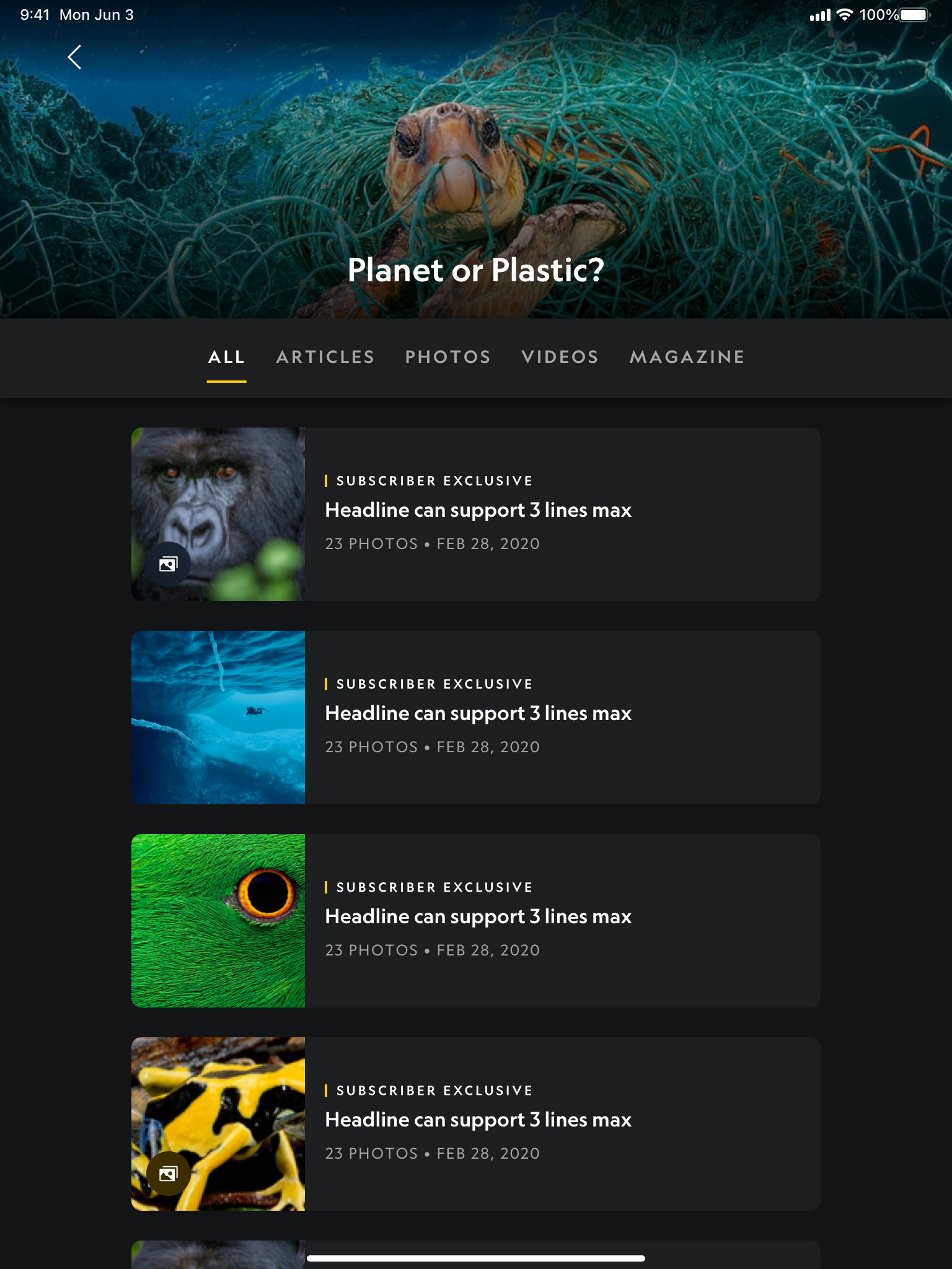
iPad - Collections - Dark Mode
If you enjoyed this project, make sure to check out the National Geographic app!