UCI Graduate Division: Project Slate
Team
UX Design Lead (Jeff)
UX Designer
UX Research Lead
UX Research Lead & Manager
UX Researcher & Engineer
Tools
Figma
Mural
Zoom
Duration
6 Months
2 Semesters
March 2020 - September 2020
In March 2020, our team of MHCID graduate students kicked off a user experience evaluation initiative in partnership with UC Irvine’s Graduate Division.
Our focus was on the Graduate Division’s admissions software program: Slate. Launched in 2018, the Slate program has since received mixed reviews, and it is now an imperative to improve the program to provide a better user experience during the annual admissions cycle.
For the project’s first of two phases, we conducted four research methods to understand the landscape and to uncover opportunities for improvement. We then created three design artifacts to help visualize and bring our findings to life. Given the breadth of our approach, we were able to uncover a robust number of insights, which are distilled into the key recommendations.
STRATEGIC RECOMMENDATIONS
● Incorporate applicant pool insights
● Improve overall visibility into the applicant lifecycle
● Incorporate more robust collaborative functionalities
● Overall design and content revamp
TACTICAL RECOMMENDATIONS
● Improve Filters capabilities
● Usability improvements to the Reader View
● Provide increased visibility into applicant SIR status
For our project’s second phase, we took the key recommendations that were identified in the first phase and turned them into design concepts. Our design process started off broad and became more refined throughout the quarter. We created low-fidelity and then high-fidelity wireframes for the following areas:
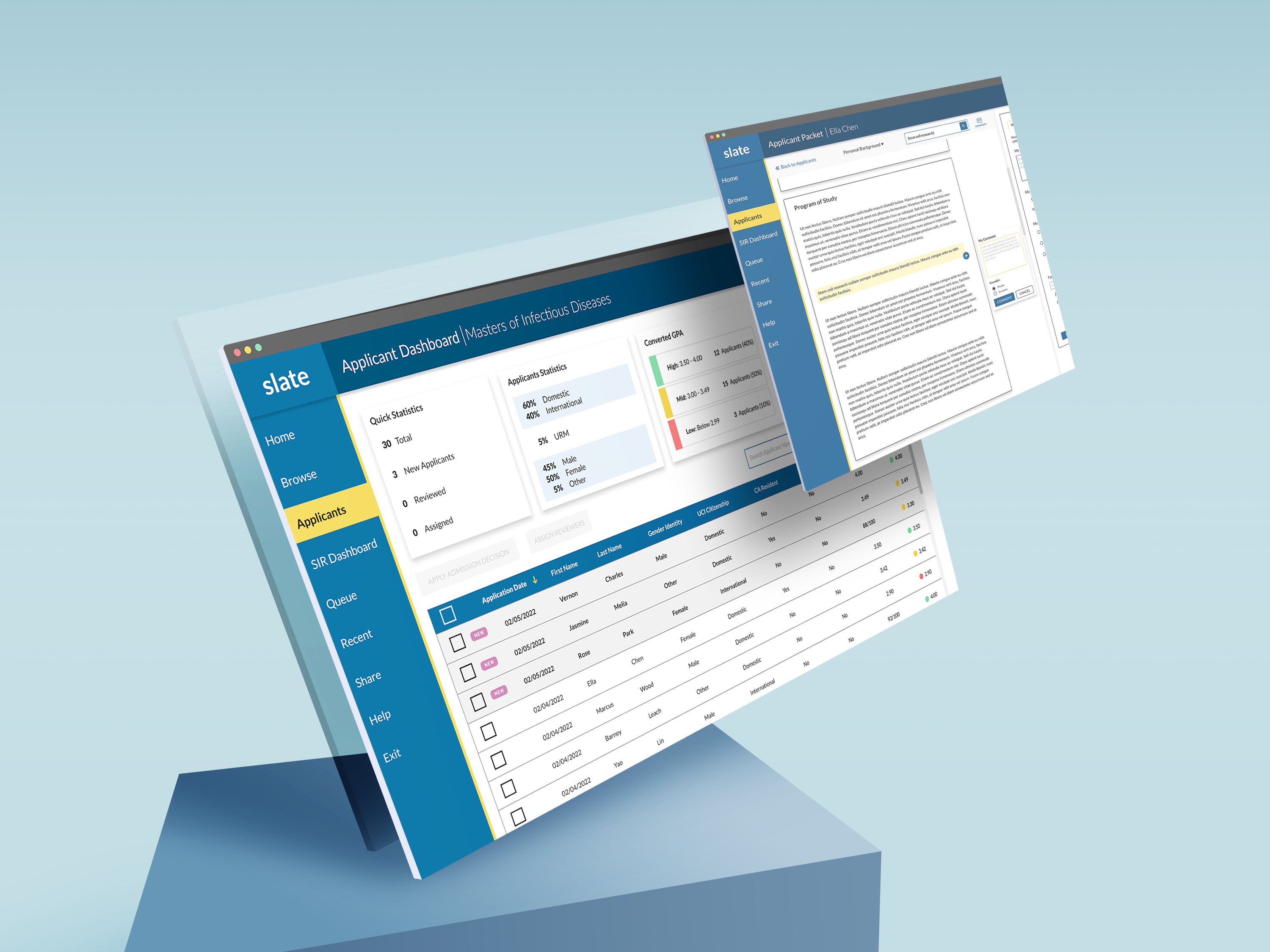
APPLICANT DASHBOARD
A central hub that provides a birds-eye view of the applicant pool, with the flexibility to sort and filter the candidates based on user needs
APPLICANT PACKET
A redesign of the Reader that allows Faculty to more efficiently review, comment, and make applicant decisions
SIR DASHBOARD
A central hub that provides easy access to SIR information to improve positive admissions yields at the final stages of the admissions cycle
These designs concepts went through 2 rounds of design testing to get users’ validation and feedback on our design solutions. We were able to uncover a robust number of insights, which are distilled into the final designs and roadmap.
Our Process
PROCESS
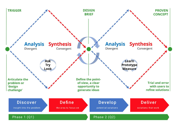
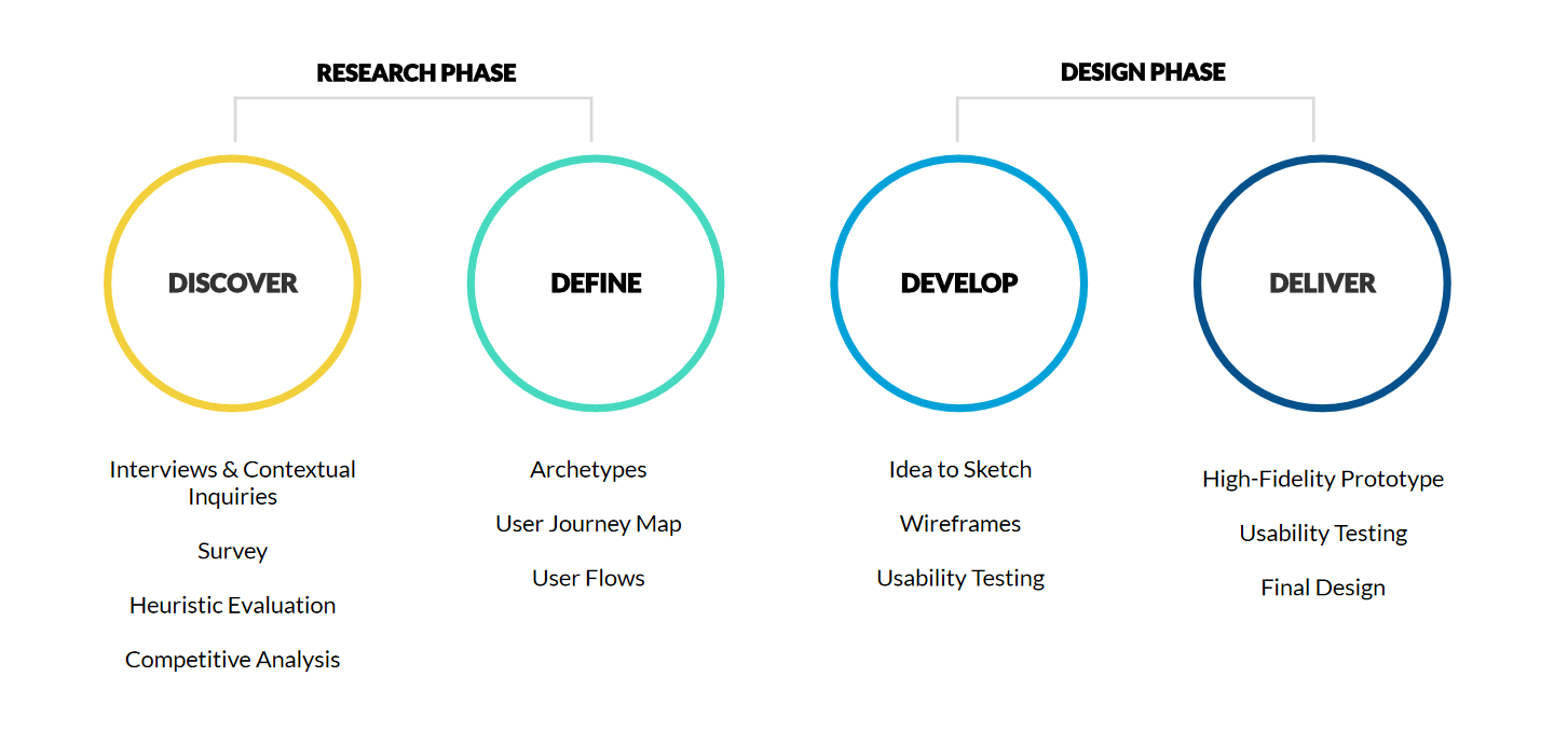
Phase 1 – Research: Discover & Define (Q1)
This phase was used to gain a better understanding of the problem space by utilizing divergent thinking to generate ideas around the user’s need and pain. By the end of this phase, the team had a good understanding of the users with enough information to start refining the feedback to actionable ideas.
Phase 2 – Design: Develop & Deliver (Q2)
This phase was focused on taking the user research findings and recommendations from Phase 1 to create a design solution. The team work on designing, user testing, and iterating on the prototype throughout Q2 to ensure that the finished product meets the user needs and expectations we uncovered in Phase 1.
By the end of this phase, the team created a high fidelity prototype that has been user-tested and refined.
FRAMEWORK
Research Phase
DOUBLE DIAMOND: DISCOVER & DEFINE
OVERVIEW
The software program they were using, Slate, was receiving lots of feedback from Faculty members that it was both challenging to use and not meeting many departmental needs. In an effort to address these challenges and improve Slate, the Grad Division tasked us – a group of Master of Human Computer Interaction and Design students at UCI – with understanding where and why these breakdowns were taking place, and to propose a better way.
This process began with foundational research. We knew that a better system would require a deep understanding of Faculty needs, so we embarked on a months-long research exploration – conducting in-depth interviews with Faculty members, administering tailored surveys, performing UX audits of the existing Slate system, and investigating competing software programs.
OUTCOME
Through these efforts, we were able to uncover the most pertinent pain points and opportunity areas, and thus understand where to focus our subsequent design solution endeavors.
INTERVIEWS & CONTEXTUAL INQUIRIES
GOAL
To gain detailed qualitative insight into how users handle graduate admissions, comprising how they see and interact with UCI Slate (focusing on pain points and positives), as well as outside processes and workarounds (focusing on utility and rationale for adopting them), for a comprehensive understanding of their mental model and workflows.
METHODOLOGY
Half of the allotted 1-hour time was spent on a semi-structured interview of the user based on a selection of areas of interest, including usage and perceptions of Slate, challenges and workarounds, other admissions tools, collaboration, and training. The other half of each session was spent on a contextual inquiry-type exploration where the user shared their screen and talked through their workflow, focusing on the areas of home, browse, queue, reader, and review process.
USERS
9 faculty who are current active users of Slate for graduate admissions and our primary user group. They range in school and department but most have 2 years of experience with Slate, corresponding with the length of time it has been implemented at UCI.
CHALLENGES & RESOURCES
We requested access to use UserTesting or UserZoom, but did not get approved. Due to time constraints and no budget provided for research, we decided to move on with the other tools we had on hand.
Our tools for conducting and recording the research sessions were Zoom, Qualtrics for gathering survey data, Mural for research synthesis, and Figma for design.
INTERVIEW INSIGHTS
- Partitioning is confusing and off-putting
- Real-time collaboration is central
- Admissions is relativist, not absolutist
- The larger the program, the more they struggle
- There are two review stages--macroscopic and microscopic
- Macroscopic stage comprises high-level weighting across many applicants to eliminate and sort
- Heavy reliance on admissions processes, workarounds, and communications outside Slate at the macroscopic phase
- Slate is a database of information to query and extract from
- Microscopic phase comprises drilling down into select individual applications to seek detailed information
- Output of the combined phases is an admit/waitlist/deny list
- There’s complexity around estimating the target numbers of applicants to admit
- Users have difficulty finding key features, believe they don’t exist. Often multiple possible paths exist for a single action
- UX writing and design elements do not match user expectations and don’t evoke actual usage
- Flexibility of Slate is lacking
- Users are forced to do a multitude of limited actions in a set order, incurring repetitive stress
- Privacy concerns around protecting data from being seen
Slate takes a maximalist design philosophy
SLATE FACULTY SURVEY
GOAL
To understand the scale and magnitude of the insights uncovered during our interview and contextual interview phase, as well as validate various hypotheses centered on the utility, frequency of use, and overall satisfaction of Slate’s most prominent applicant review features: Widgets, Bins, Queue, Review Form, and Queries.
METHODOLOGY
Our survey was designed and administered through Qualtrics, using a series of predominantly closed-ended questions and Likert scales. The survey included a total of 30 questions (including an optional email address collection question at the survey close), and was broken into sections centered on feature use and out-of-Slate workarounds. These process-based questions (three in total) were not captured in our initial survey deployment, but will be analyzed separately in the coming weeks. We received a total of 43 completed responses, with as many as 57 recorded responses for questions at the beginning of the survey. The completion rate was 75%.
USERS
43 faculty who are current active users of Slate for graduate admissions and our primary user group. The plurality of respondents worked within the Information & Computer Sciences department, although 11 schools in total were represented.
KEY INSIGHTS
CONTEXTUAL LEARNING
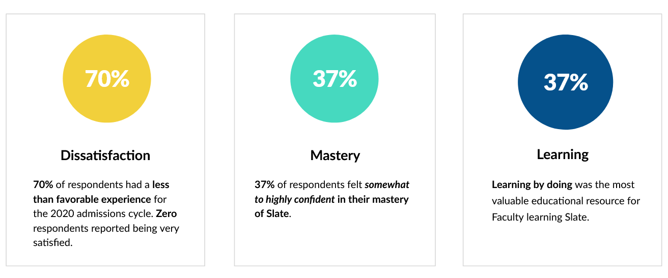
Regarding respondents’ Slate learning process, learning by doing was their most valuable resource, with attending training and working with departmental staff tied for second.
- This could indicate that a more tailored approach to learning Slate by departmental needs may increase overall mastery and confidence in the platform.
FREQUENCY AS A MAGNIFIER
Lack of feature utility is strongly correlated to lack of overall satisfaction with Slate for the 2020 admissions cycle. In particular, beliefs that Filters, Bins, and Widgets were not useful to respondents applicant review process were most strongly tied to diminishing satisfaction with Slate.
- When combined with usage metrics, this data could indicate that features which are accessed more frequently (even if by necessity) should require increased utility over other features.
DON'T KNOW HOW TO USE & WORKAROUNDS
Respondents who had “no opinion” of the features are strongly correlated to lack of use (either never or rarely). For Queries and Bins this was 100% and 71%, respectively. In addition, there’s a secondary correlation between never using a feature and finding it very unuseful.
- Together, these data could indicate that respondents either don’t know how to use the feature or that they’ve found another workaround that suits their needs.
EFFICIENCY & PROCESS CHALLENGES
The following feature challenges were most strongly correlated with lack of overall satisfaction (neutral to negative sentiment) with Slate for the 2020 review cycle:
- The Queue’s lack of support for cross-faculty collaboration (58%)
- Having to reset Filters with every browse or search activity (76%)
- Review Forms do not reflect the departmental ratings criteria used by faculty (74%)
The Slate system’s conceptual model doesn’t reflect Faculty needs for efficiency, collaboration, or ratings within the applicant review process.
COMPETITIVE ANALYSIS
GOAL
To understand the pros and cons of certain features and implementations to help make informed decisions when improving the Slate platform.
METHODOLOGY
A competitive analysis is a strategy where we identify the major competitors and understand their approach to the same type of product. We evaluated 1 home grown platform, 2 direct competitors, and 3 other schools who are using Slate. Within each evaluation, we looked at their existing features, user interface, and structure.

HOMEGROWN (1)
GATS (Graduate Application Tracking System by UCI)
The system allows users to compare applicants’ information in batches.
Having a spreadsheet style interface allowed users to sort and rank applicants on a high level.
DIRECT COMPETITORS (2)
Target X
They offer a feature that allows users to review the applications. It has a similar style as Slate but with a modern user interface.
Element 451
Element 451 most important features are their automation and analytics tools along with their clean user interface design, which uses up to date design trends to display the information.
OTHER SCHOOLS USING SLATE (3)
Baylor University
John Hopkins University
UC Merced
Baylor university and Johns Hopkins University implemented their Slate platform similarly to UCI.
On the other hand, UC Merced made interesting implementations that stood out amongst the rest of the schools.
KEY TAKEAWAY
- User interface update would enhance the presentation of information.
- GATS was working well due to the simplicity of it. Slate has more features but failed to capitalize on them by not catering to the users and their needs.
- Other competitors have a clearer organizational structure for displaying list information compared to Slate.
- UC Merced broke down their faculty role into 4 sub-roles to assign specific Slate permissions into finer detail.
MEET THE USERS
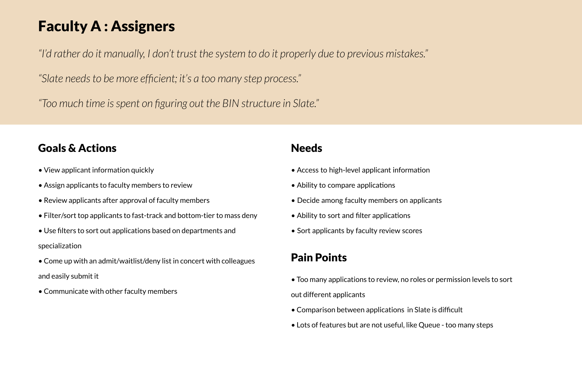
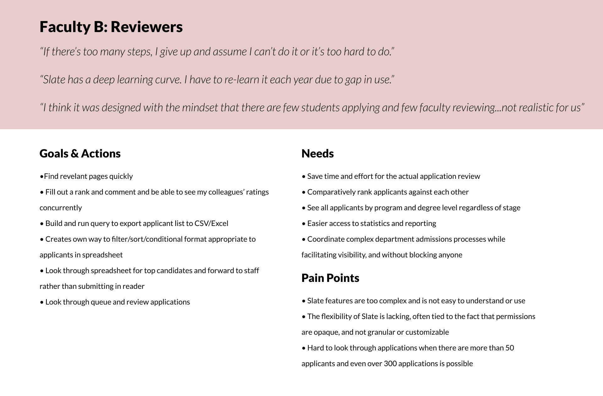
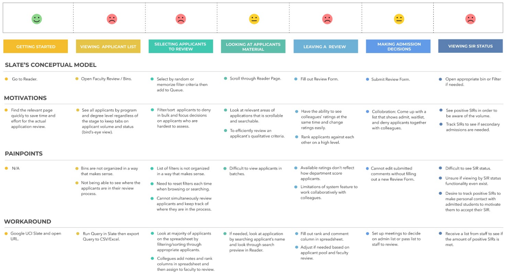
USER JOURNEY MAP
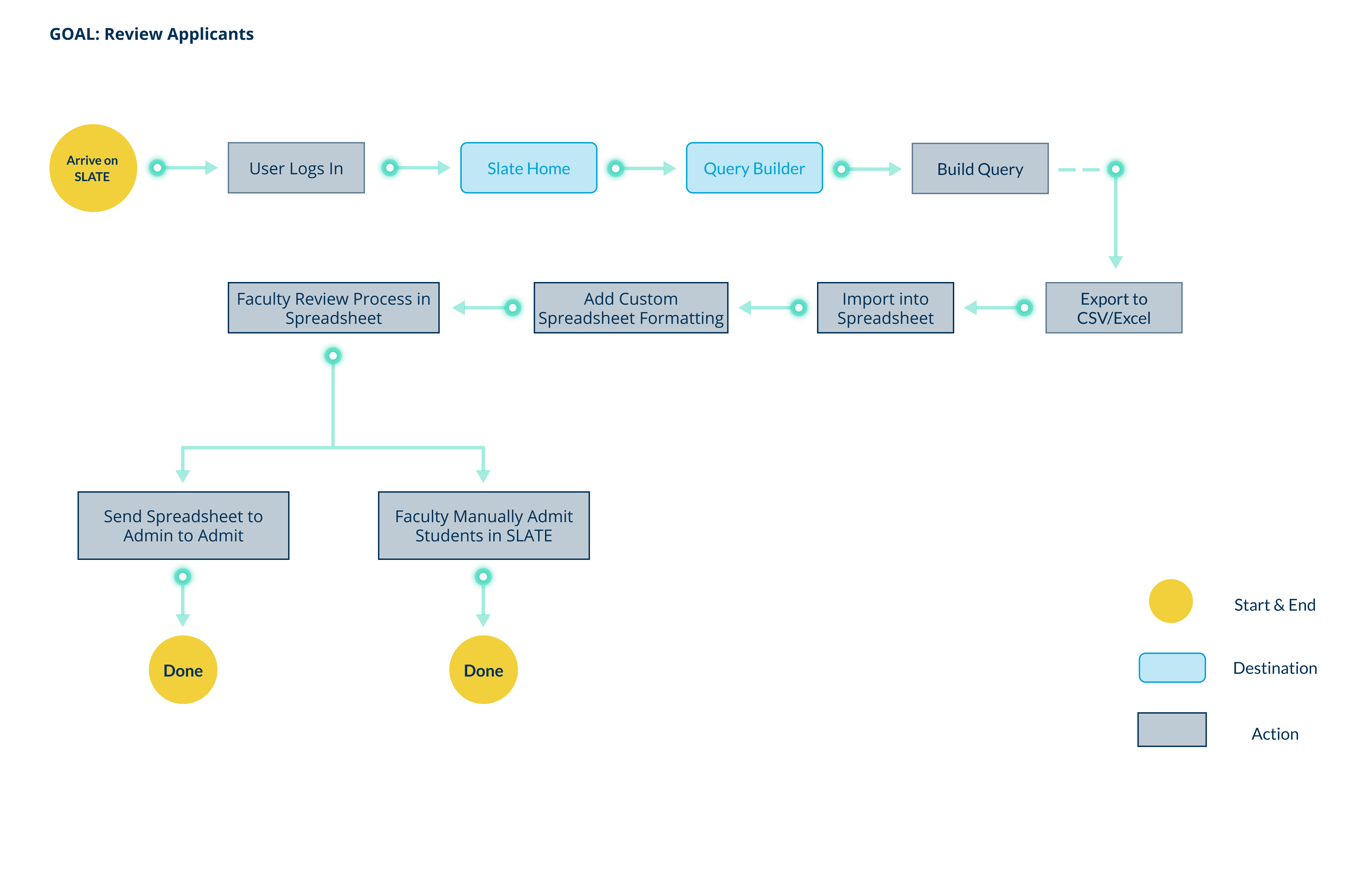
USER FLOW - SLATE SUGGESTED
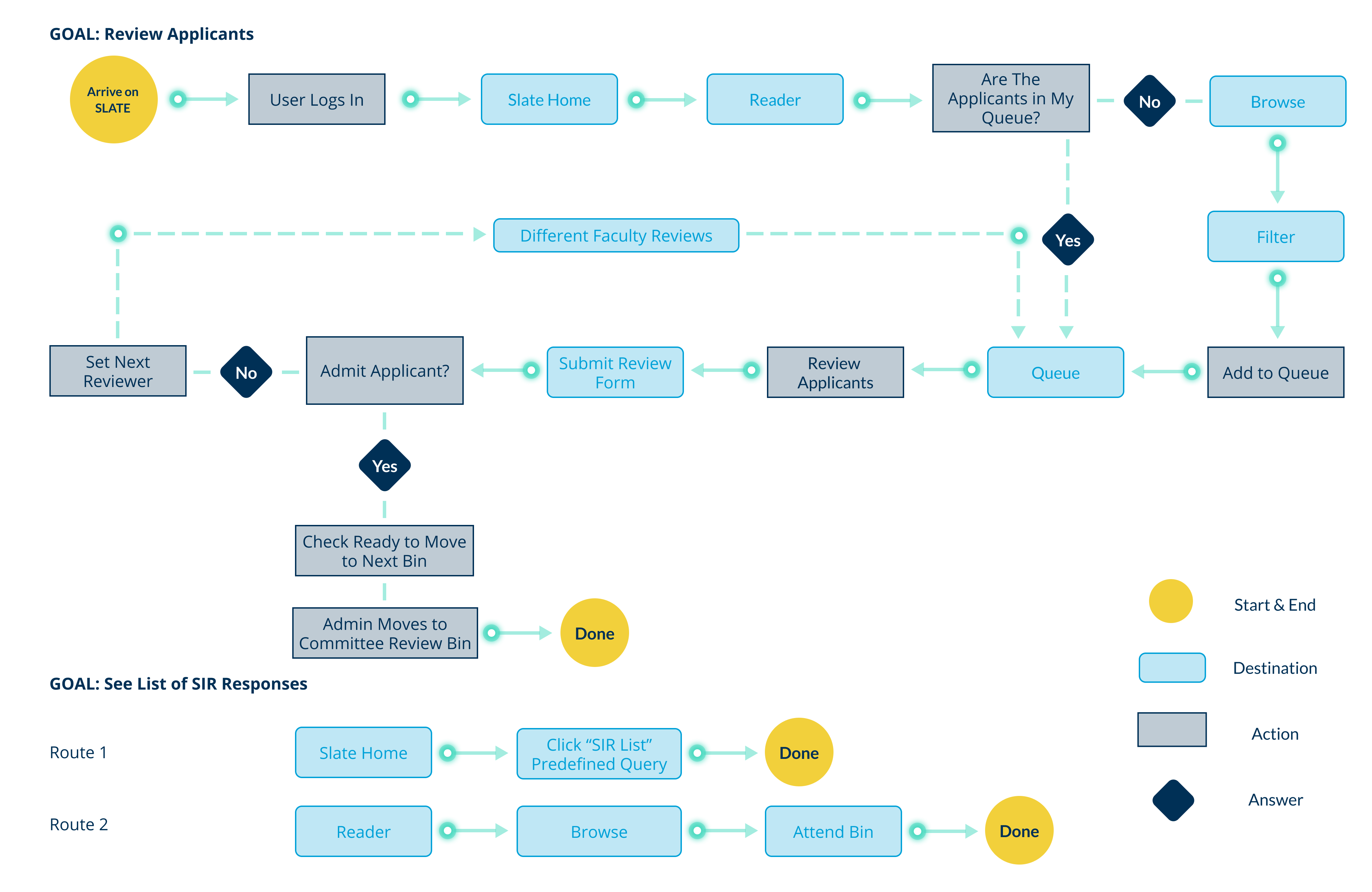
USER FLOW - FACULTY'S ACTUAL FLOW
RECOMMENDATIONS
GUIDING PRINCIPLES
- Design for the user and their needs
- Simplification and focus over flexibility
- Limit the need for per-user customization
- Balance strategic and tactical recommendations
STRATEGIC VS. TACTICAL
The following recommendations are a mix of both Strategic and Tactical which allow the Slate team to create a path forward of continuous improvement. Inside of each Strategic recommendation we will identify opportunities for immediate benefit to take steps towards the larger vision.
Design Phase
DOUBLE DIAMOND: DEVELOP & DELIVER
OVERVIEW
Our research insights showed us that the existing system was inflexible and limited, and that it didn’t fit Faculty members’ mental models of their actual admissions processes. As a result, many Slate Faculty users were satisfying most of their admissions process tasks OUTSIDE of Slate. We also uncovered that department-wide collaboration during the review process was common. However, the importance of certain admissions criteria and applicant characteristics varied across departments and programs.
Further, because Slate is a third-party software program, we were immediately constrained by what could be implemented by program administrators within the Grad Division versus what would need to be escalated to Slate’s parent company, Technolutions. This meant we had to spend time identifying where we could provide differentiated value for Faculty members without full-on customization.
OUTCOME
We did this by identifying the “big rocks” – those overarching “process needs” that were consistent across departments, and within those, considering how we could design a new system that was flexible enough to solve for multiple departmental use cases.
REDESIGN FOCUS
DASHBOARD APPLICANT
This was a large focal point in our design efforts. We designed a dashboard from scratch to serve as a central hub for Faculty to view, filter, and compare applicant information at a glance.
APPLICANT PACKET
We completely redesigned the Applicant Packet to create a smooth experience in reviewing, commenting, and making applicant admissions decisions.
SIR DASHBOARD
The SIR Dashboard was also designed from scratch, with the goal of providing a simplified and informational tool through which Faculty can view the status of accepted applicants.
INITIAL IDEA TO SKETCH
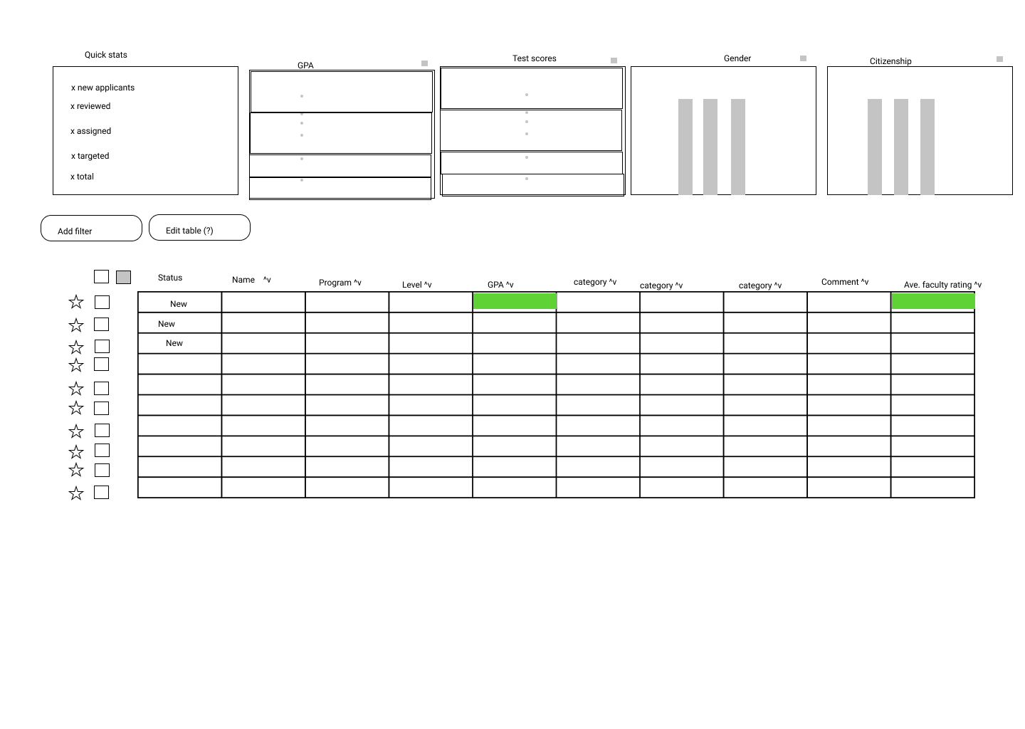
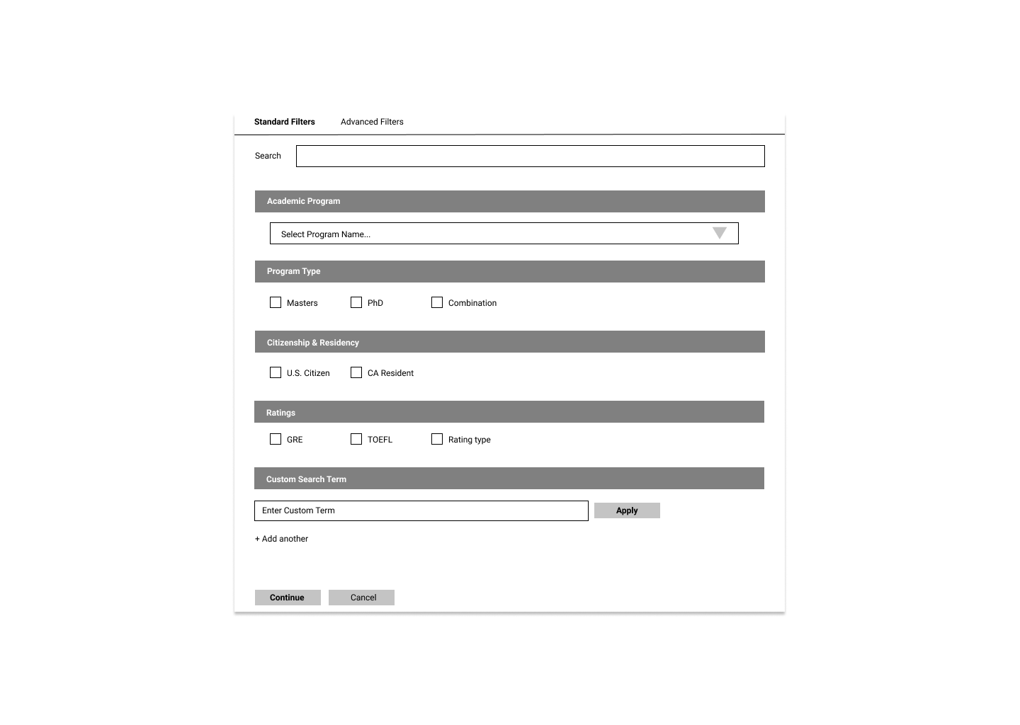
Our initial idea was to explore these features to improve the experience: color coding the grid list, graphs to indicate applicants, ability to favorite or select applicants, and simplified filter.
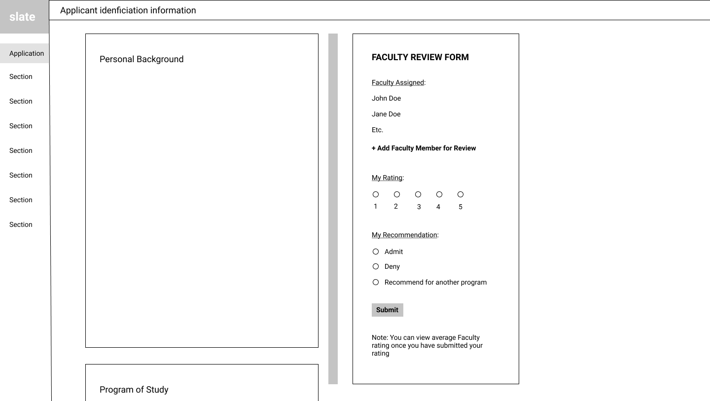
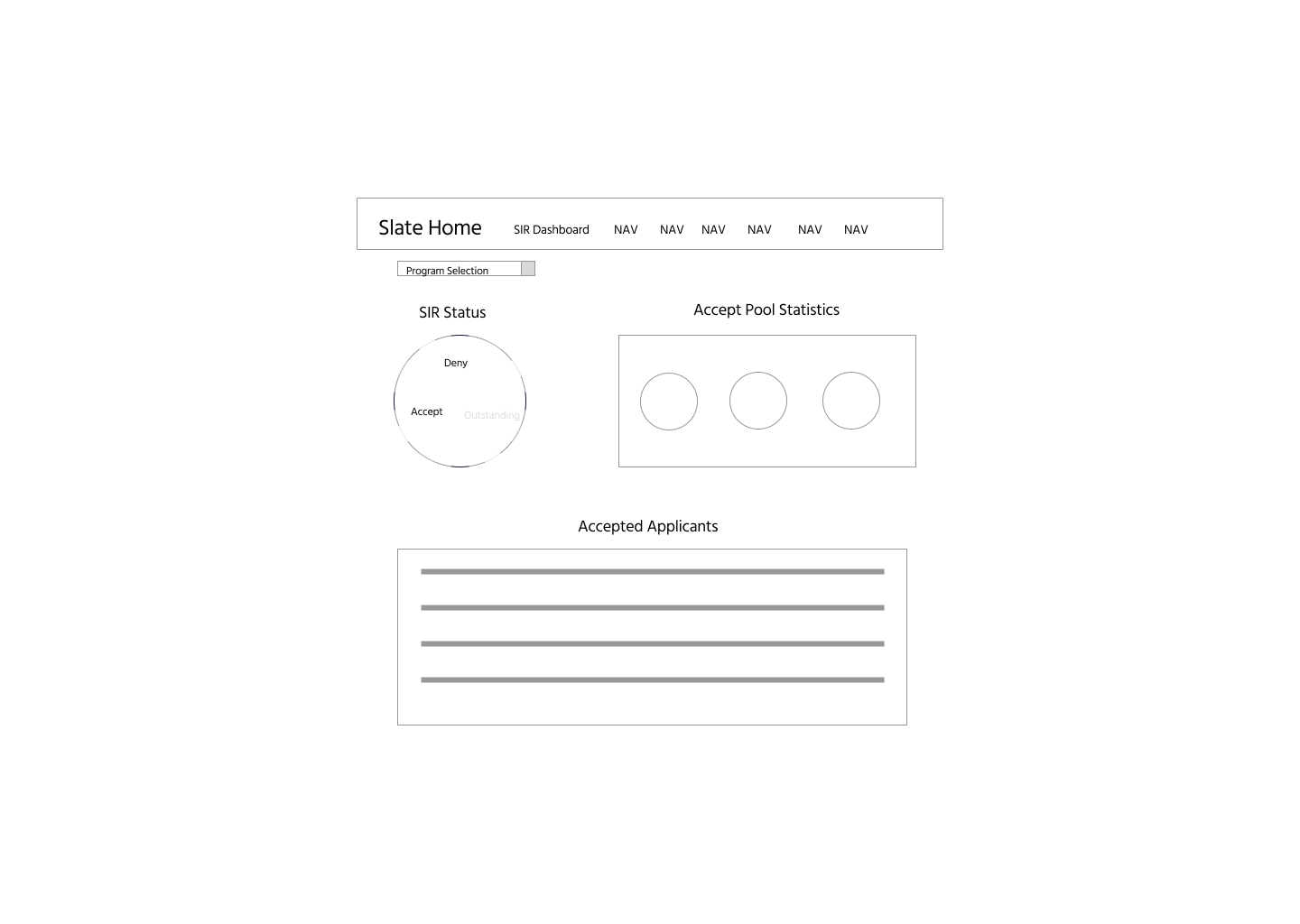
Our initial idea was to explore these features to improve the experience: vertical scrolling of packet, easy review form, graphs to display accepted applicants in the SIR Dashboard, and quick statistics of applicants
If interested in seeing the rest of the lo-fi concept design testing, hi-fi concept design testing, and the final concept design.